Creator Profile: Ed Morrill
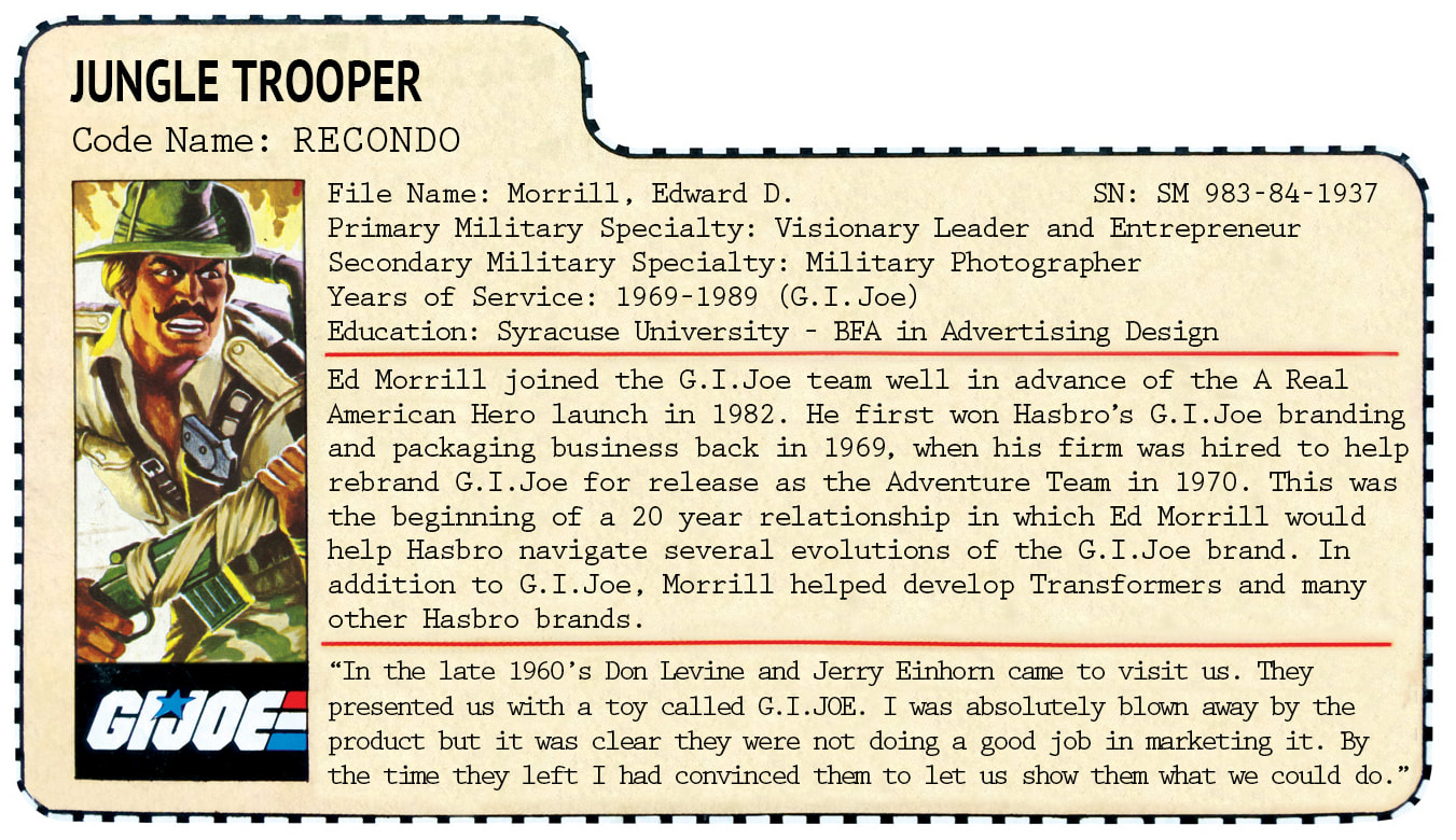
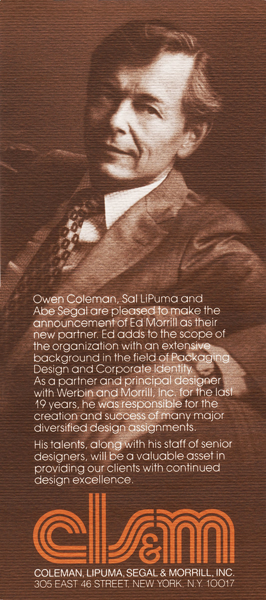
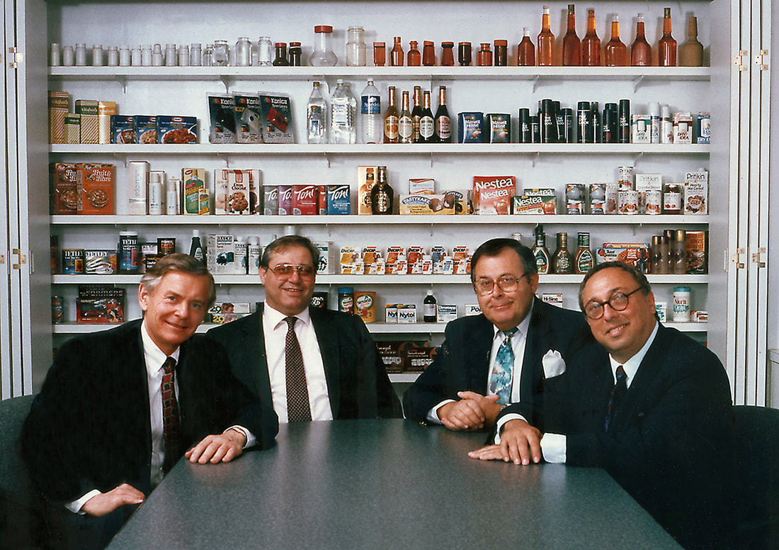
Ed Morrill partnered with Hasbro to help develop and evolve G.I.Joe branding and packaging for 20 years, from 1969 to 1989. Read on to learn more about this incredibly productive designer and entrepreneur!
But first, some thanks.
This Creator Profile was created by Carson Mataxis and Chris Murray. We would like to thank Ed Morrill for the many hours spent in interviews with 3DJoes. Also, we would like to thank Jon Cremeans and Matthew McKeeby for their Adventure Team expertise. Special thanks to Shawn Morrill, Mark Vanis, John Wakefield, Chris Murray, and Ben Conway for their contributions. All photos, scans, videos and audio files are used with permission and ©2012-2023 3DJoes. All Rights Reserved. No usage is permitted without written permission.
Ed Morrill's career path, from the U.S. Army to A Real American Hero
Ed Morrill has had a long and interesting career. Here's a chronological recap of Ed Morrill's career:
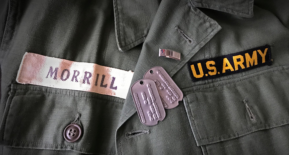
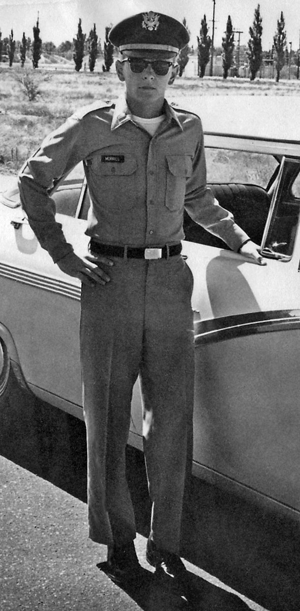
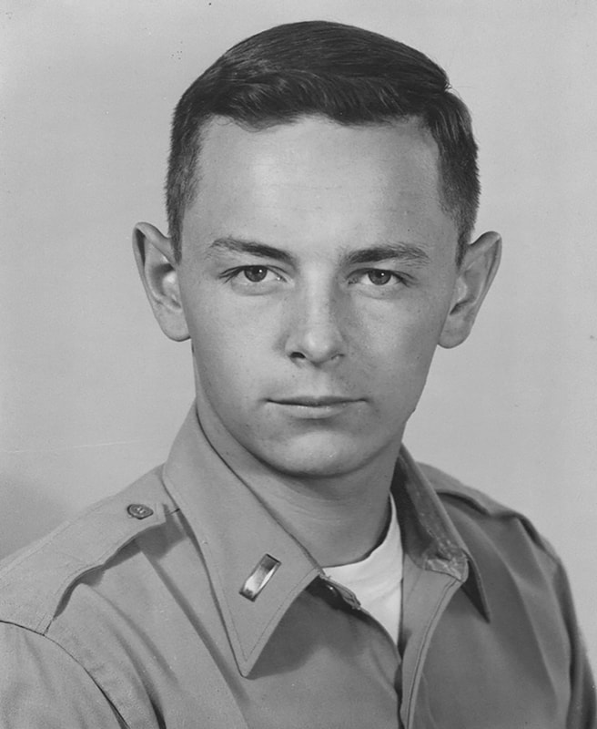
United States Army Signal Corps. (June 1960 – June 1963, 3+ years)
First Lieutenant serving as Officer-in-Charge of the photographic department at Sandia Base, New Mexico.
Werbin & Morrill Inc. (August 1964 – November 1982, 18+ years)
Partner at independent design firm specializing in package design, brand identity and corporate identity. Partner.
Edward Morrill Design Assoc. (December 1982 – December 1983, 1+ year)
Owner of independent design firm specializing in package design, brand identity and corporate identity.
Coleman, LiPuma, Segal & Morrill (CLS&M, January 1984 – November 1996, 12+ years)
Principal and Managing Partner in independent design firm specializing in package design, brand identity and corporate identity.
More in depth explanations of Mr. Morrill’s career and details on his work with the G.I.Joe brand follow below.
The U.S. Army
When asked why he chose to serve in the U.S. Army, Ed Morrill replied: “I knew I wanted to be an officer. I don’t know why. While in cub scouts, boy scouts, church, clubs… I always felt everyone could be better. I wanted to be in a leadership role." Ed set his sights on ROTC and then the U.S. Army Signal Corps which would give him a shot at getting into photography, his passion. He was stationed as active duty at Sandia Base on the southeastern edge of Albuquerque, New Mexico. He served as a First Lieutenant in the Army Signal Corps as the Officer-in-Charge of an extensive photo lab within the Atomic Weapons Training Group, where he directed the work of soldiers, sailors and airmen. He served for two years and then the Cuban missile crisis took place and created a time of heightened military preparedness. In Ed's words: “they froze us in” and he ended up serving a third year due to the crisis. He loved living in New Mexico, his "love life was set," and he could hunt, fish, and play tennis.
While in the military Ed Morrill was frequently freelancing as a photographer. The Army wanted him to stay in and become a helicopter pilot, but he opted to leave New Mexico and the Army to pursue package design in New York City. The hardest part of breaking into that field in NYC was moving photography to the back burner. Ed recalled a CBS Records interviewer asking him if he was more interested in photography or design. It was at that point he realized he needed to revise his portfolio to be a design director, enabling him to direct relevant photography, combining both of his passions.
Click the images below to view them full screen.
Irving Werbin Associates (later Werbin & Morrill Inc.)
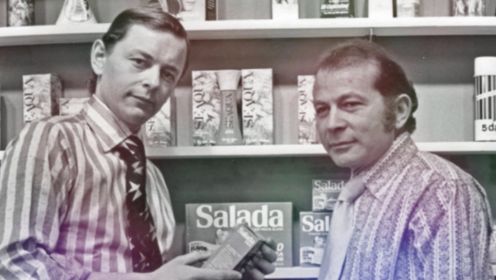
Ed Morrill joined Irving Werbin Associates in 1964 because there was opportunity there. This small seven-person agency had room to grow. Ed mused “He needed somebody like me.” At the time he had another offer from a bigger firm that was offering more money, but he chose Irving Werbin Associates for the greater opportunity to have an impact.
Owen Coleman worked at Irving Werbin Associates too, and this would be the beginning of a 20-year working relationship. Ed aspired to success, while Owen aspired to greatness. “At the time our clients included companies in the cosmetics, hair products, liquor, food, and recording industries.” It was not all easy going: “In 1965 I was a struggling young staff designer at Irving Werbin Associates in N.Y.C. I was just starting my career, having just completed three years active military duty. So, I was a rookie designer but not exactly a rookie in other respects.” Way back in college at Syracuse, Ed knew he wanted to be in packaging design. "Packaging lasted longer than advertising." He loved the enduring nature of branding and packaging, and professionally he recalled how making a unified packaging line was much more fulfilling than making an amazing single product.
It was here that Ed Morrill would first cross paths with G.I.Joe. “In the late 1960’s a couple of interesting fellows from Hasbro (Don Levine and Jerry Einhorn) came to visit us." Ed laughed: "Don Levine was so slick, he was straight out of central casting for NYC. He had many interesting pursuits in Manhattan."
Don and Jerry had been instructed by the Hassenfelds to come to New York to find a design firm that could help Hasbro redesign the initial G.I.Joe packaging and develop more exciting visual branding for the line. Ed recalled that "at that point they were doing most packaging in house. It pains me to look through the 1969 Toy Fair catalog." Ed's immediate thought was that in the right context, these G.I.Joe toys could look lifelike. He was amazed by the details, and the pose-ability was key. "What they were doing at the time was crappy illustrations and even worse photography. I was absolutely blown away by the product and they were not doing a good job in portraying it.”
Winning the work would prove to be an uphill battle. While Ed was very impressed by G.I.Joe; Irving Werbin, his boss, was not. As the meeting progressed Ed recalled "taking the lead and imagining out loud how we could create packages which would communicate the unique play value of this realistic, fully articulated boy’s action figure. By the time they left I had convinced them to let us show them what we could do.”
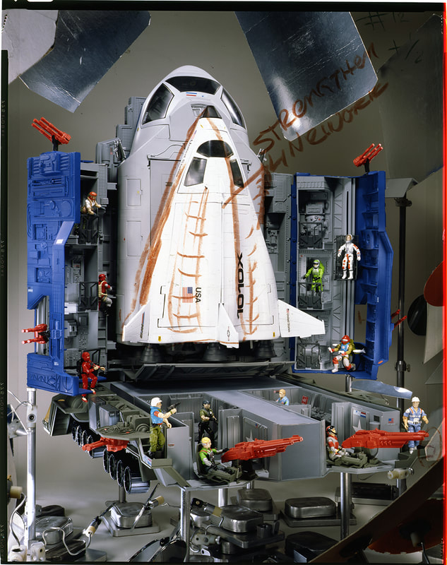
“I set about finding the time and resources in our small firm to create mockups of package concepts. Mostly in my afterhours time I made rough sets in our studio and photographed Joe in a range of environments: deep sea diver in an aquarium, astronaut in space, jungle trooper. Thanks to the detailed outfits and pose-ability the resulting images were exceedingly life-like and the resulting comprehensives with greatly improved graphics communicated our vision and, coupled with my obvious excitement, convinced Hasbro to give us the go ahead to redesign the line and prepare mockups of the entire line for Toy Fair 1970!”
Ed Morrill recalled of the redesign that "keeping the G.I.Joe name was obviously a wise decision and initially we made only slight improvements to the logo in order to keep the equity. We created a strong impactful design format for the line that was more unified and allowed for maximum space to portray Joe in his exciting adventures."
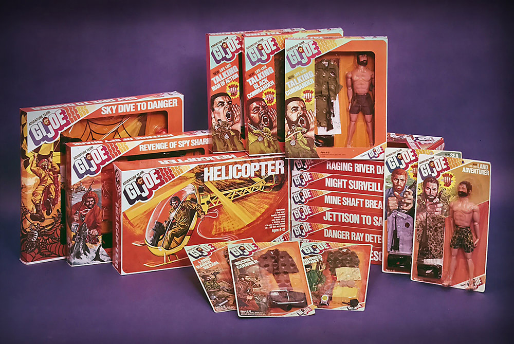
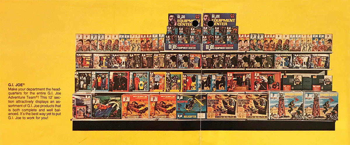
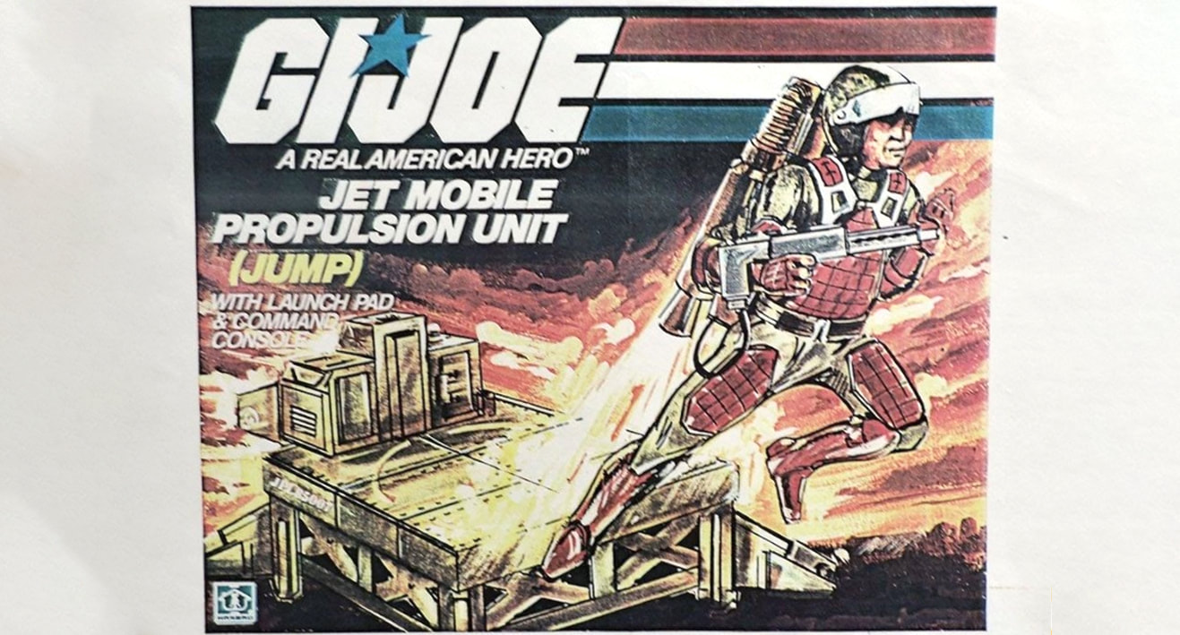
Below are some of the colorful and exciting G.I.Joe Adventure Team products developed by Irving Werbin Associates (later Werbin & Morrill Inc. once Ed Morrill became Partner).
Managing the art of the Adventure Team
Before we go in depth on the work, it is important to credit Hasbro's "excellent art directors who greatly aided the overall effort. Chief among these were Tom Lavely in the 1970’s and Matt Lizak in the 1980’s. They really helped make it all happen." Throughout our interviews, Ed Morrill spoke highly of Lavely and Lizak.
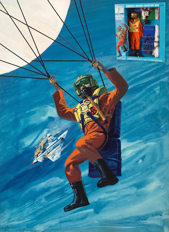
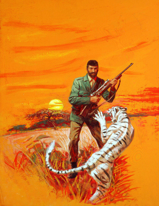
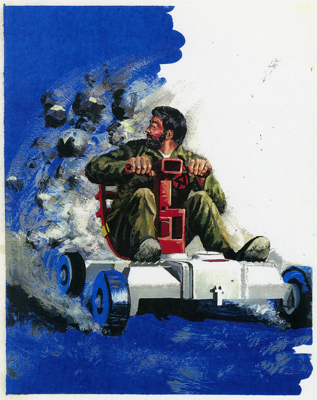
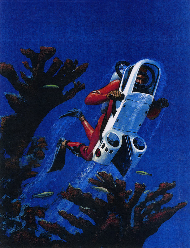
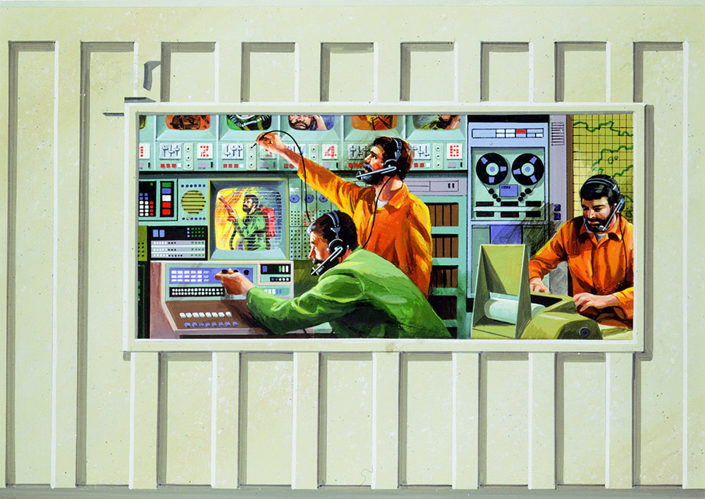
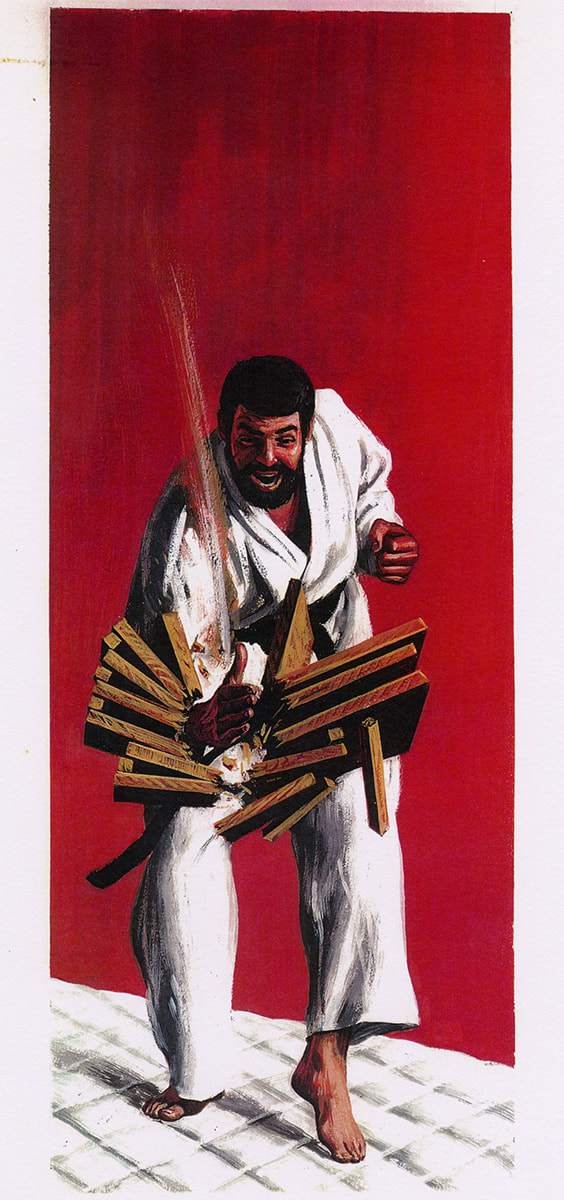
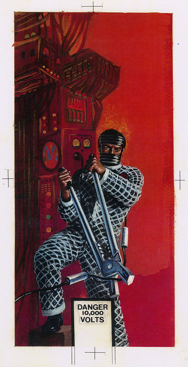
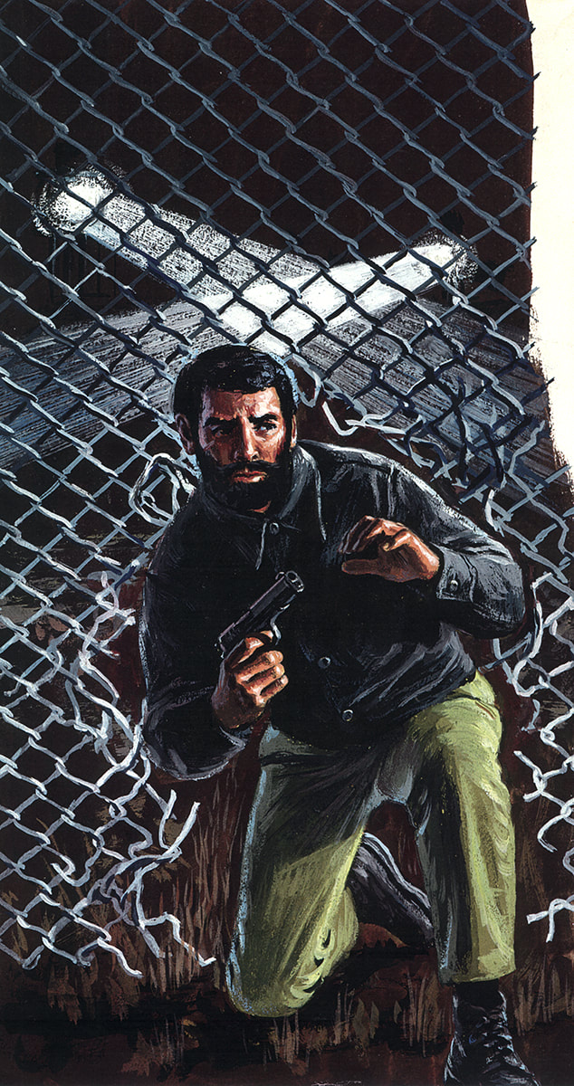
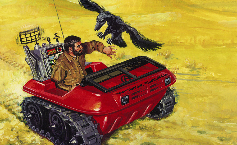
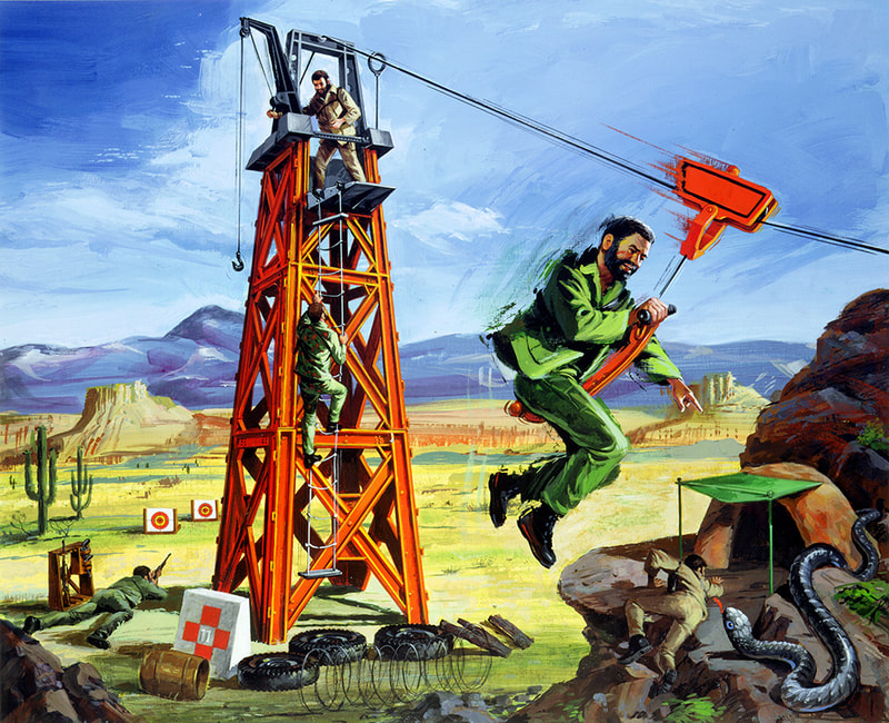
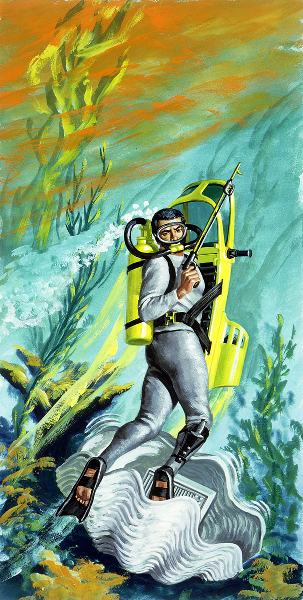
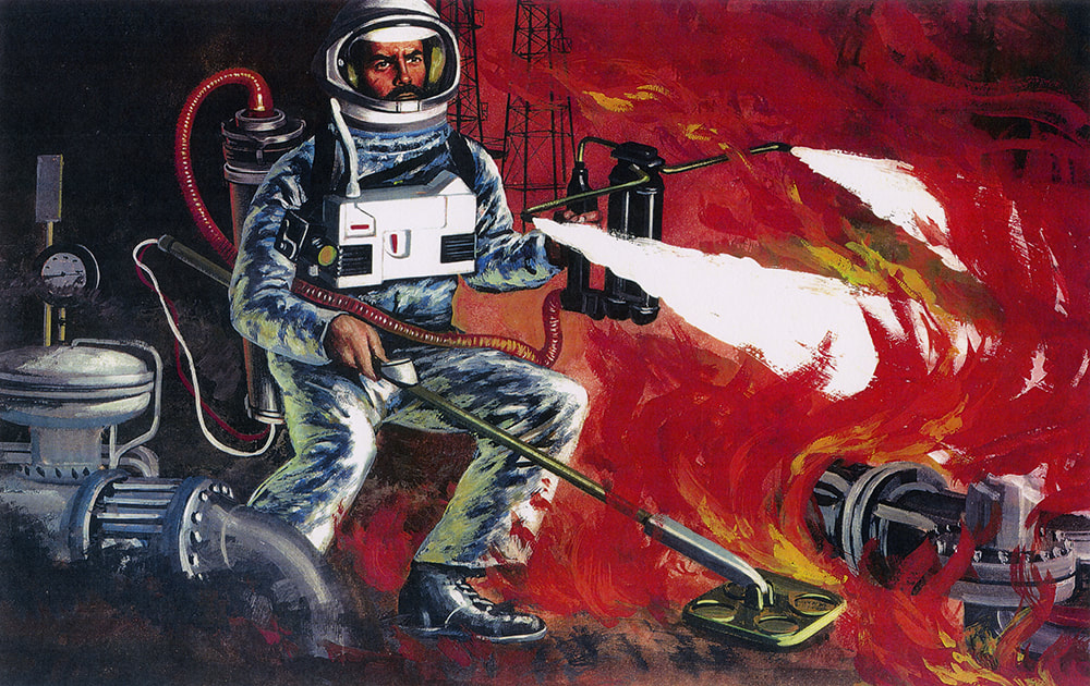
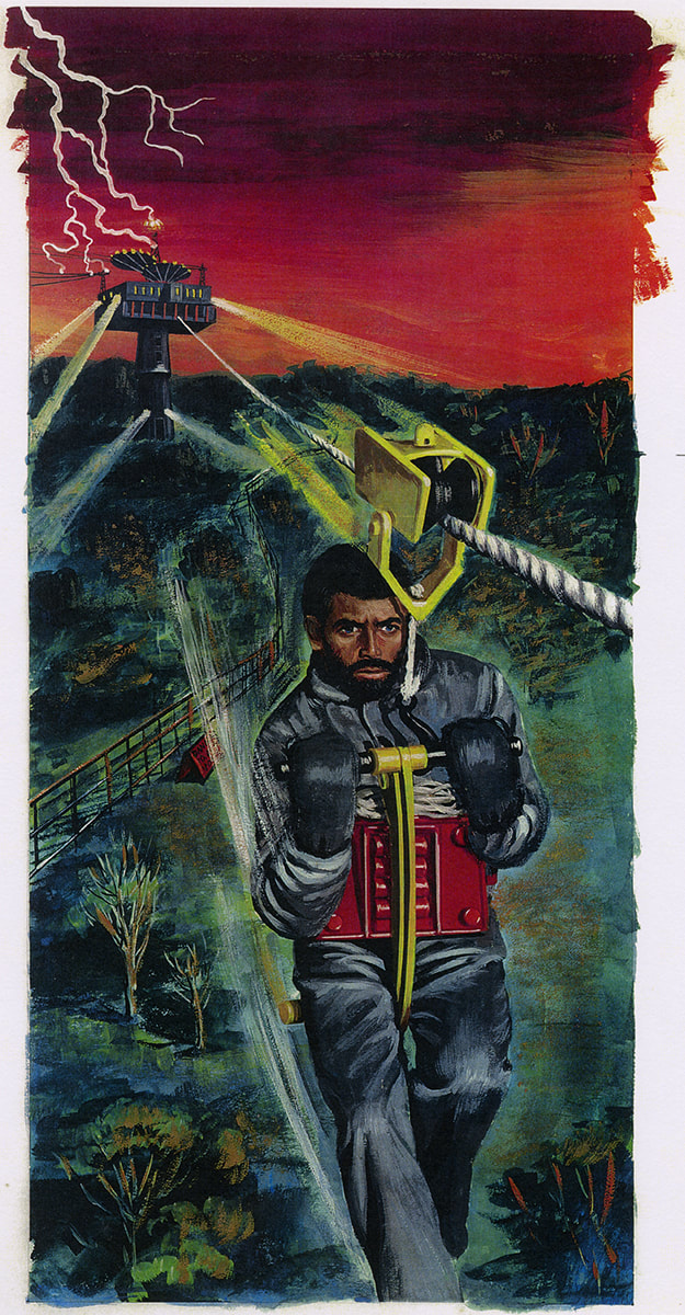
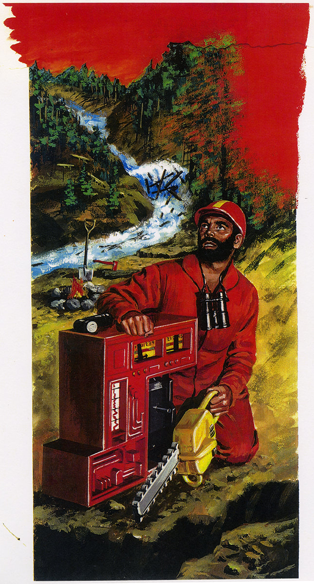
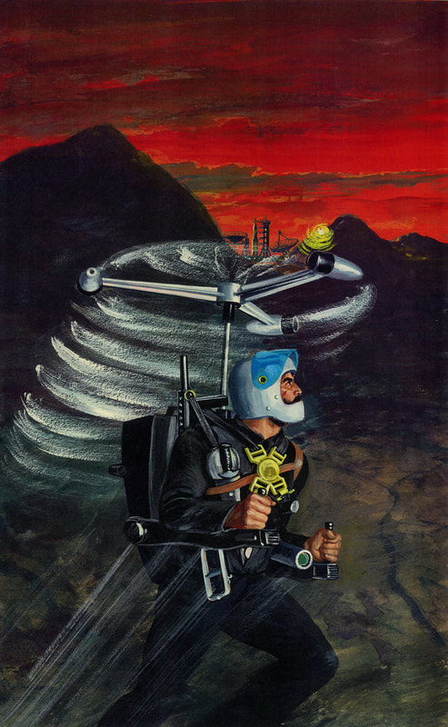
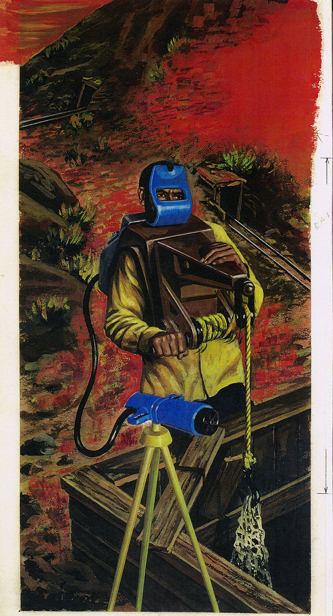
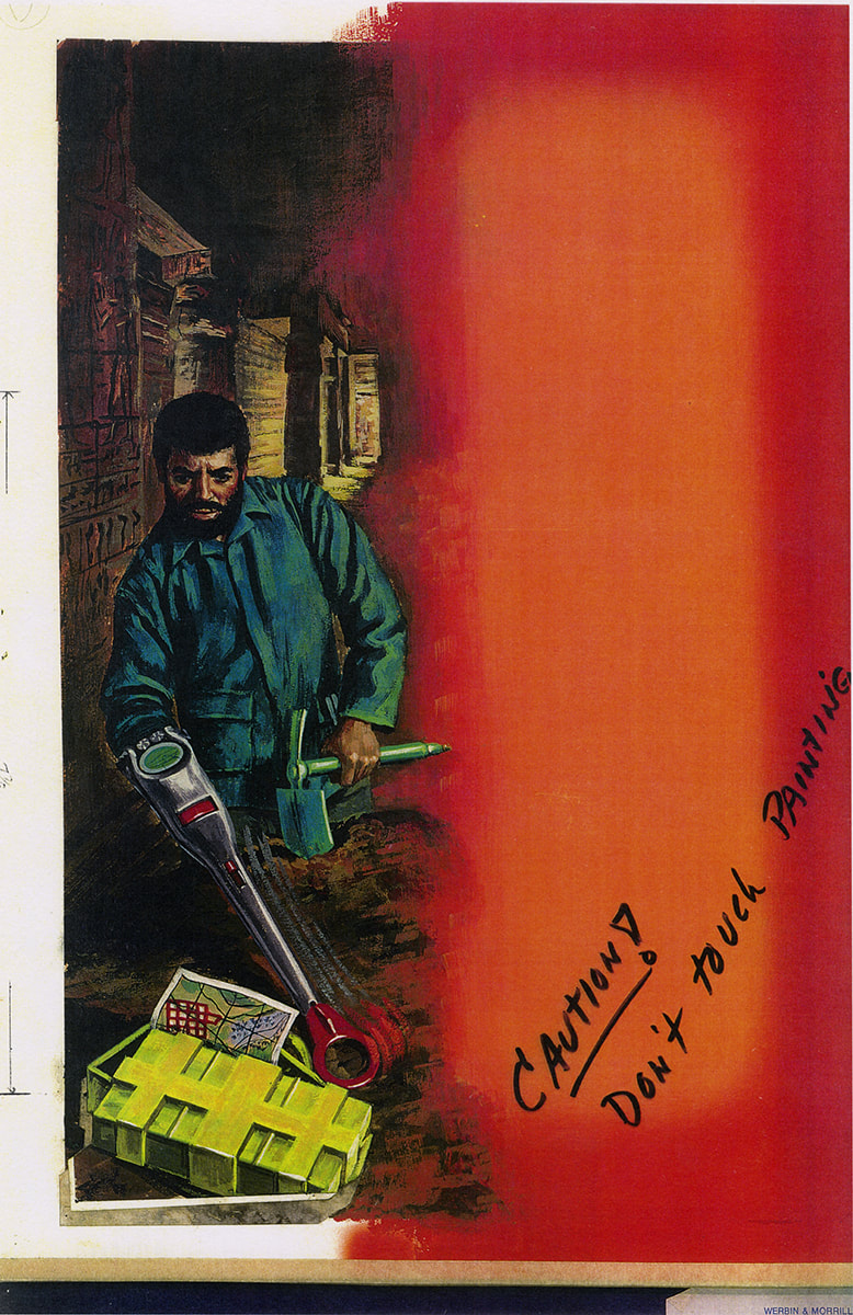
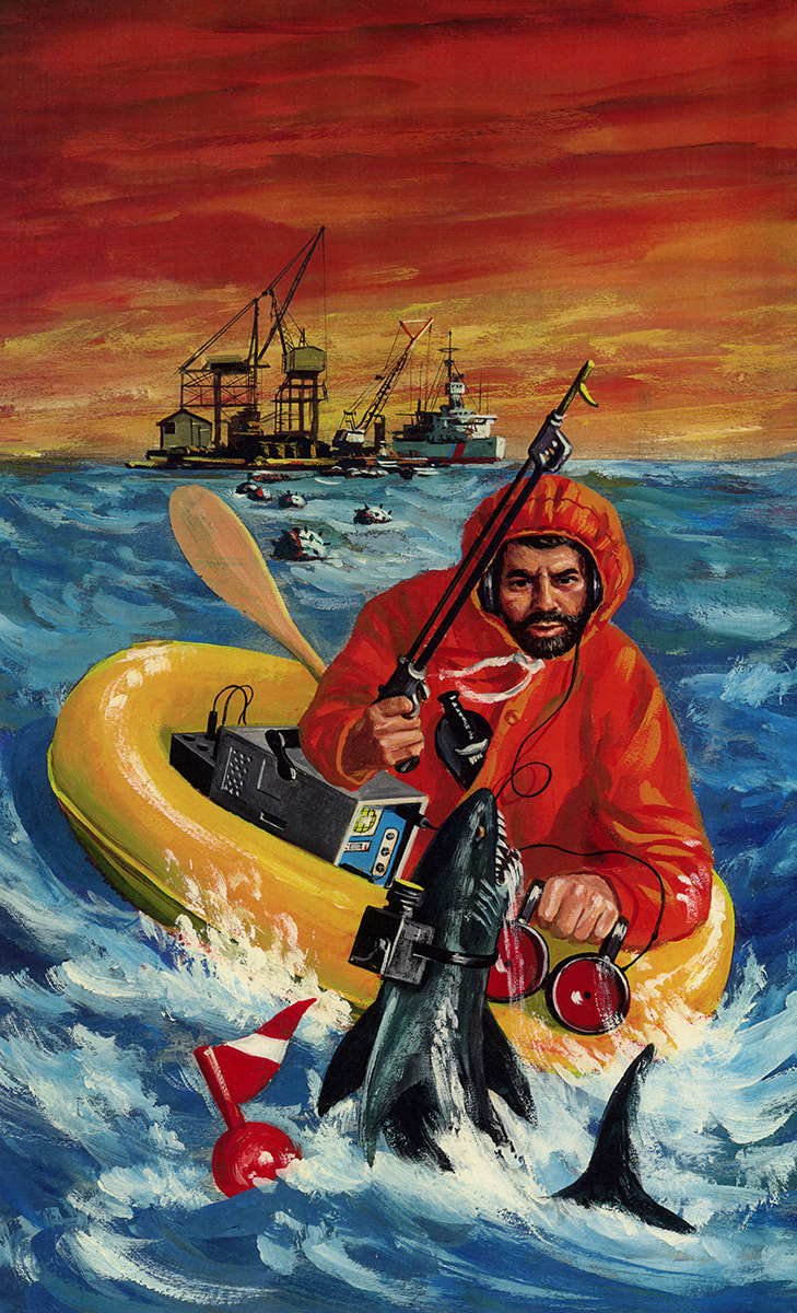
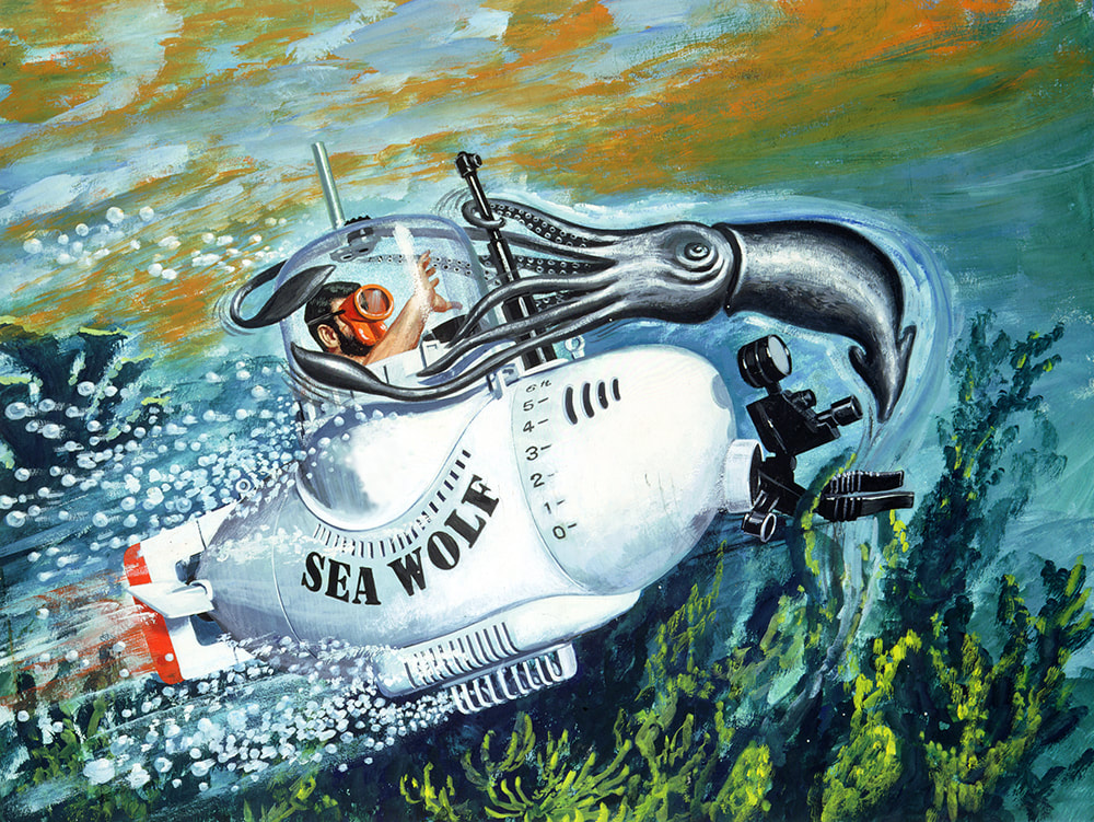
One of Ed Morrill's many responsibilities was to select and manage the illustrators who worked on G.I.Joe packaging. In the 1970s he hired Don Stivers through Mendola Artists Representatives.
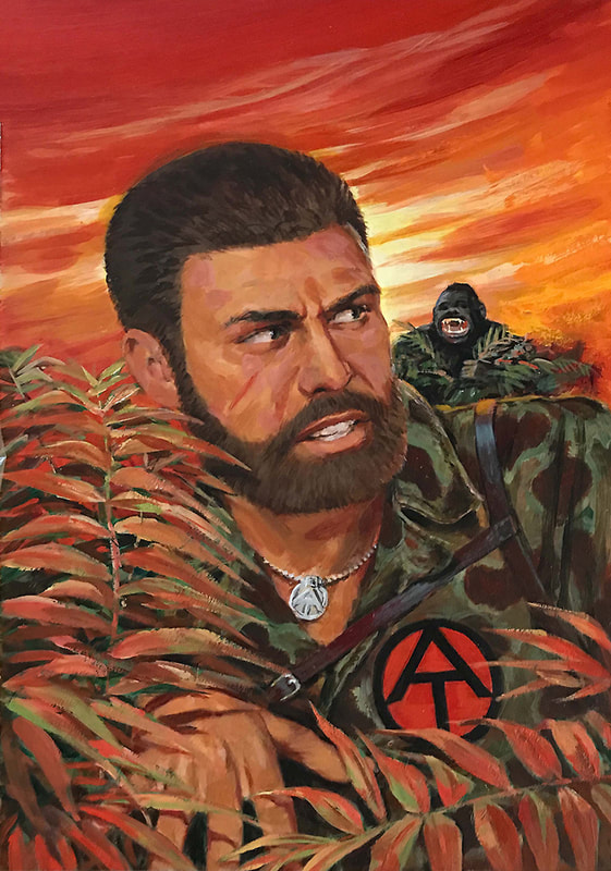
Ed recounted his partnership with Stivers: "Finding the best possible illustrator was key and our search paid off with the selection of Don Stivers. Don was an amazing talent, able to translate my rough sketches and direction into exciting action-oriented images that the kids could relate to. As always, logistics was a factor. Don was represented by Joe Mendola Artist Representatives, and it seemed like Mendola’s staff was always at my door, waiting to hand carry my sketches, the product prototypes and all other materials off to Don’s studio in Connecticut and pick up the work he was doing to bring back to us in Manhattan the next morning. Not the easiest way to do business, but as Don and I soon developed an understanding of what was needed, and with his incredible productivity, the work flowed smoothly."
Below are some samples of the 1970s artwork Don Stivers created for the Adventure Team. Roll over the images below for more information, or click to view them full screen.
Thank you to Jon Cremeans for help in identifying these works. Visit Vintage3DJoes.com to see more of the Adventure Team!
|
Branding G.I.Joe: A Real American Hero
When Hasbro decided to re-launch G.I.Joe in 1981, it wasn't long before Werbin & Morrill Inc. were called in to help with branding and packaging. Matt Lizak (Hasbro’s vice president of graphic design) would closely manage Ed Morrill's efforts.
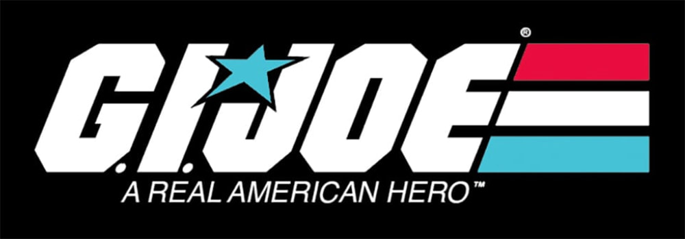
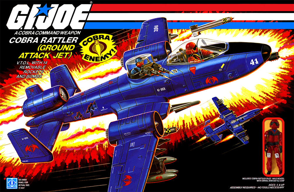
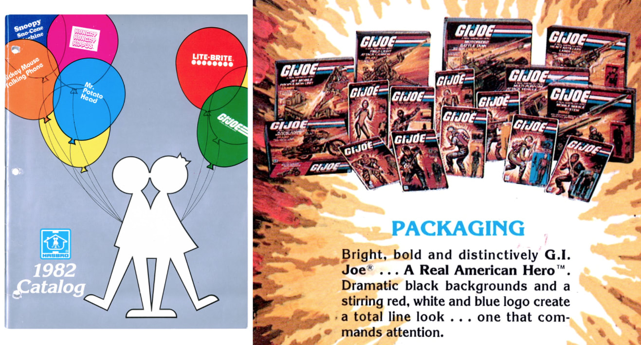
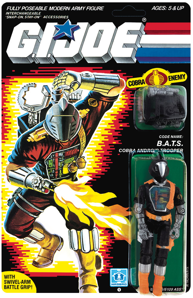
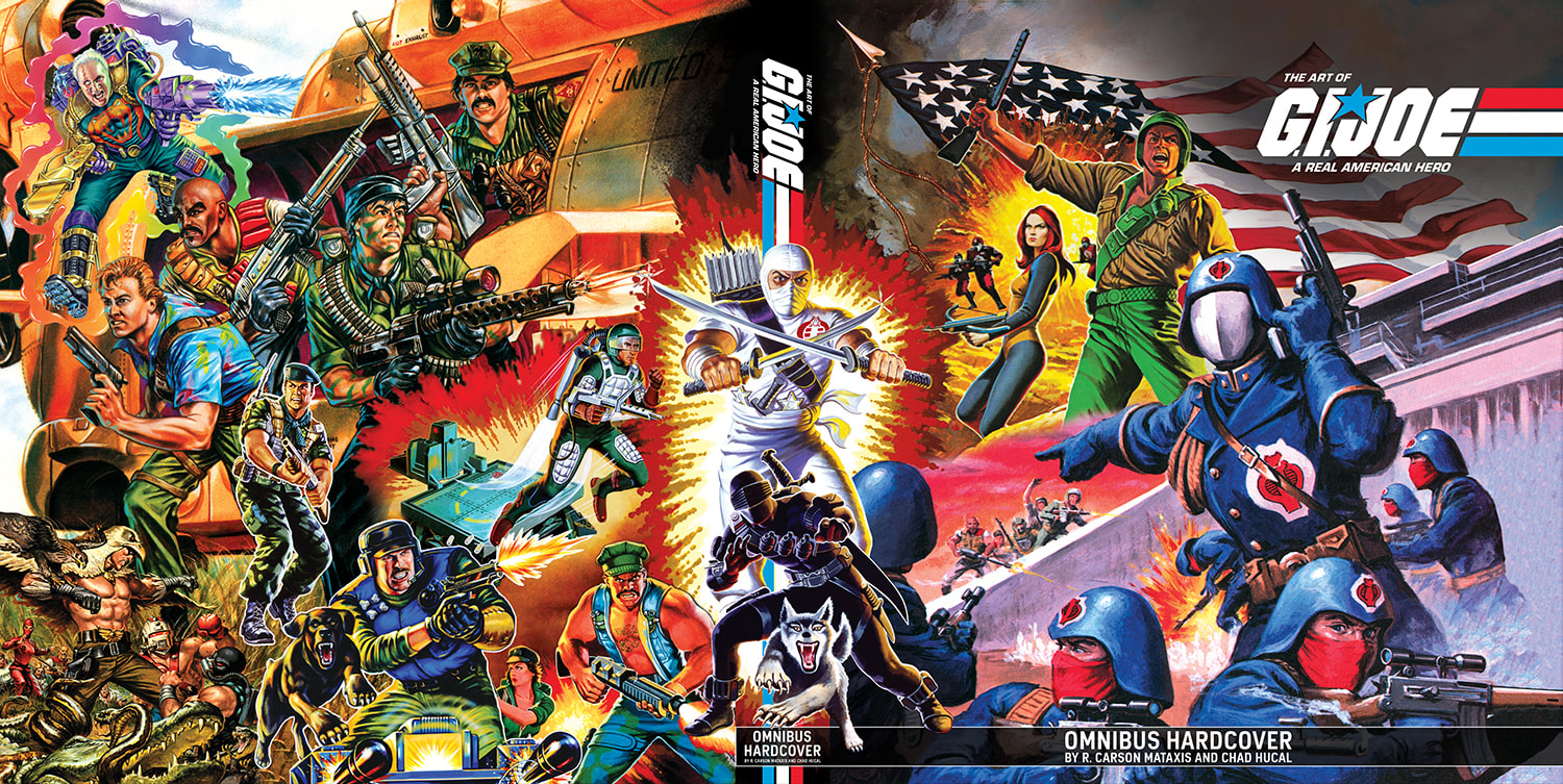
Ed Morrill knew the redesign of the G.I.Joe brand for the A Real American Hero era had to look different than the previous expressions. Perhaps the most striking design decision of the 1982 re-launch was to use a black background. Black provides maximum contrast for optimal pop of the logo from the package and while this appears natural to us now, black was simply not used in toy aisles. Best practices of the era called for bright colors. The chunky block letters showed the strength of the brand, while the italicization indicated motion - this was a brand on the move! The stripes (or action lines) called back to the later 1970s logo and again played up that this was a logo in motion. They decided to get rid of the head above the J, recalling that "it got a little cheesy no matter how well you did it" and replaced it with a star. They wanted to play up the patriotism of the “A Real American Hero” brand, so the blue star and the red, white and blue stripes added an impactful touch of color. They wanted a clean, not overly complex logo - it didn’t require a lot of embellishment. Kirk Bozigian recalled that "Ed Morrill presented five G.I.Joe logo options to Matt Lizak, Bob Prupis and myself, and the winning logo was selected."
Ed Morrill knew the redesign of the G.I.Joe brand for the A Real American Hero era had to look different than the previous expressions. Perhaps the most striking design decision of the 1982 re-launch was to use a black background. Black provides maximum contrast for optimal pop of the logo from the package and while this appears natural to us now, black was simply not used in toy aisles. Best practices of the era called for bright colors. The chunky block letters showed the strength of the brand, while the italicization indicated motion - this was a brand on the move! The stripes (or action lines) called back to the later 1970s logo and again played up that this was a logo in motion. They decided to get rid of the head above the J, recalling that "it got a little cheesy no matter how well you did it" and replaced it with a star. They wanted to play up the patriotism of the “A Real American Hero” brand, so the blue star and the red, white and blue stripes added an impactful touch of color. They wanted a clean, not overly complex logo - it didn’t require a lot of embellishment. Kirk Bozigian recalled that "Ed Morrill presented five G.I.Joe logo options to Matt Lizak, Bob Prupis and myself, and the winning logo was selected."
|
As for the rest of the package, they knew they needed something other than a black background behind the product illustration. They knew they didn’t want "the messy and time-consuming task of creating backgrounds or landscapes for each product." They wanted a unifying element, something exciting. They couldn't have too much black on the package, "that would be recessive" (a very bad term in the packaging field).
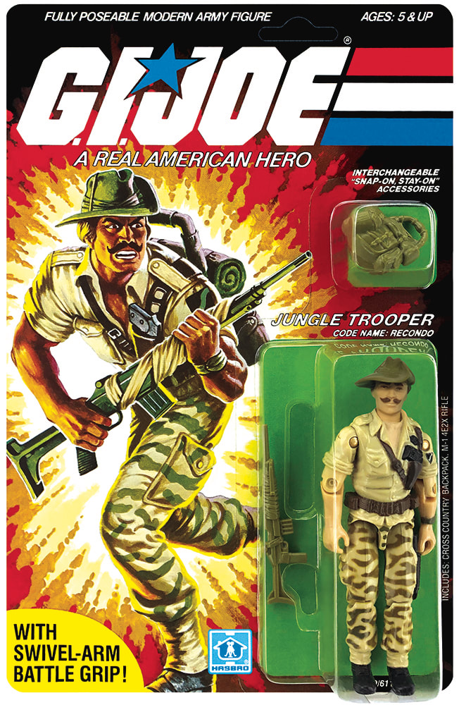
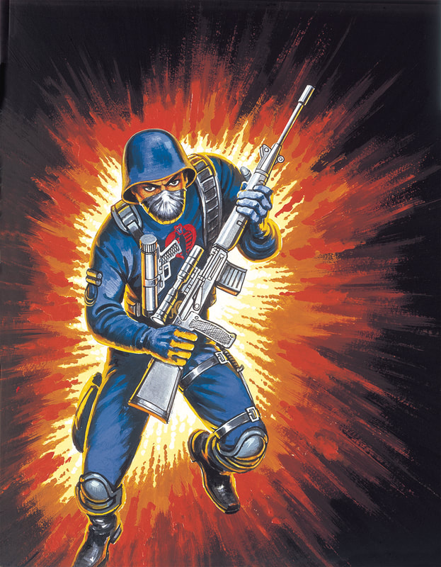
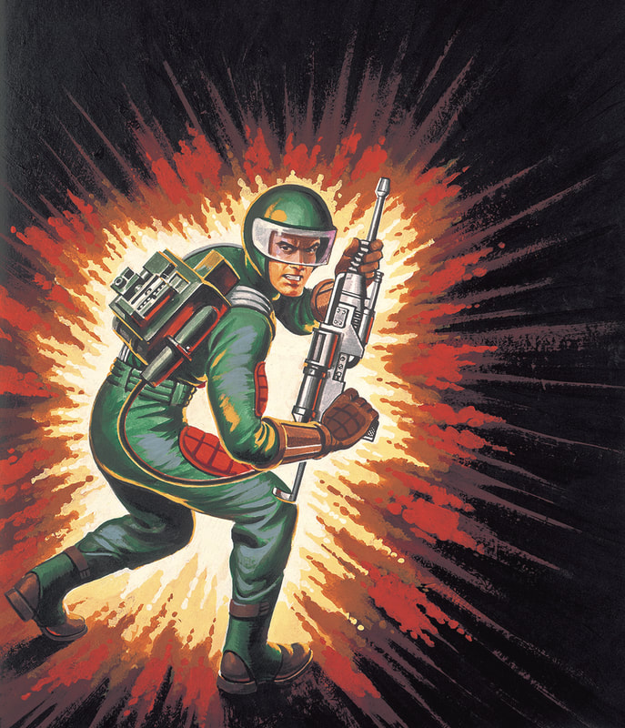
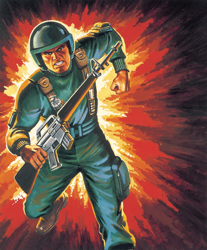
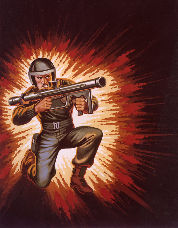
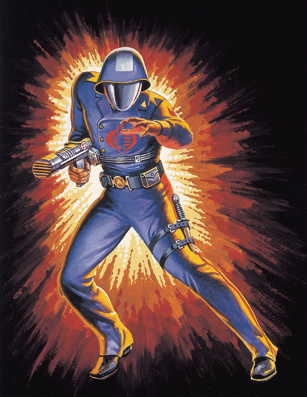
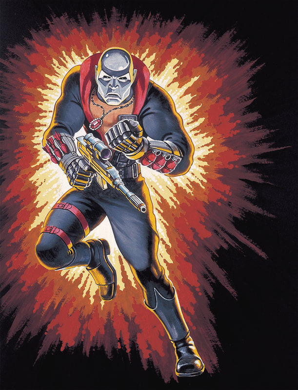
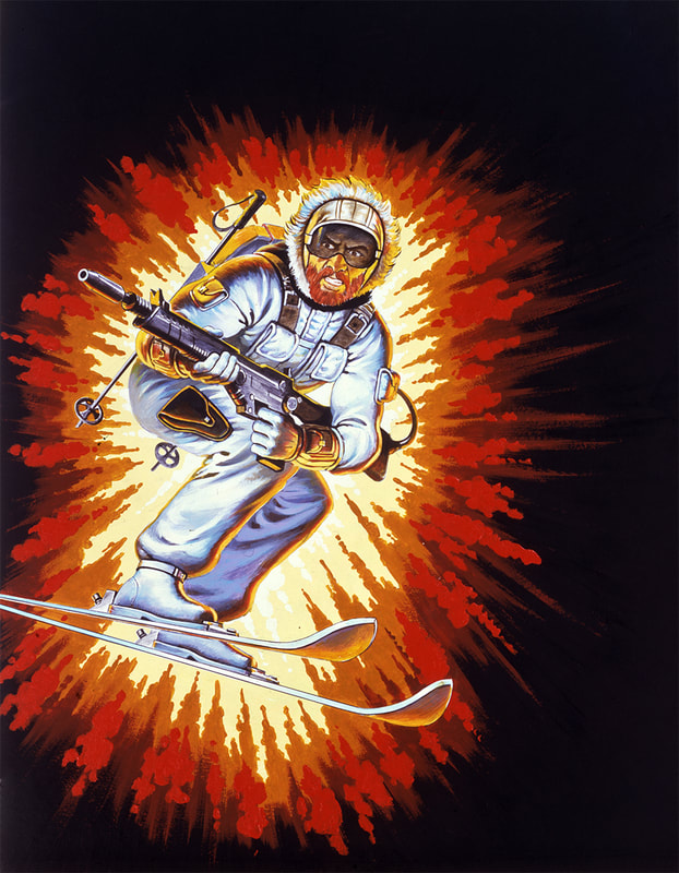
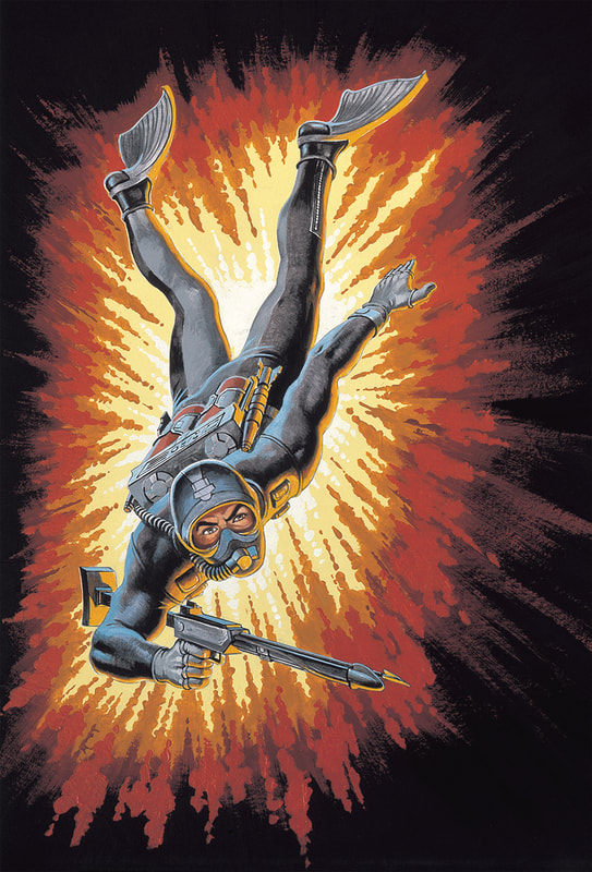
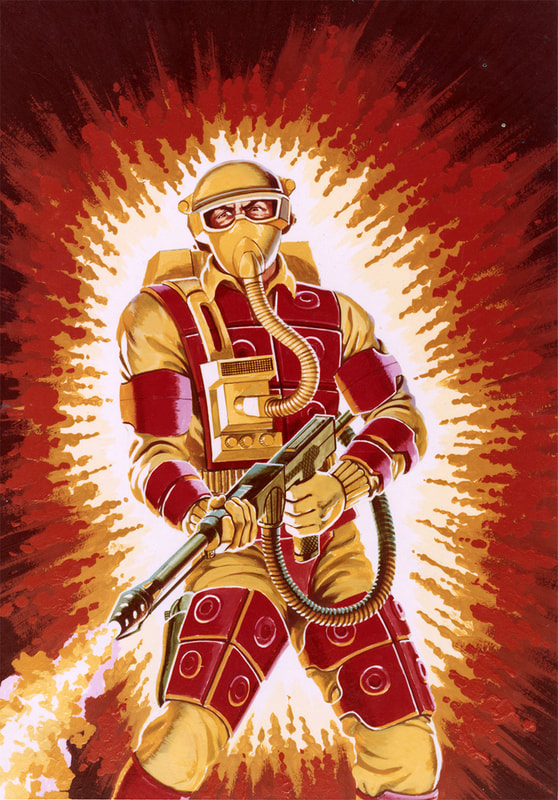
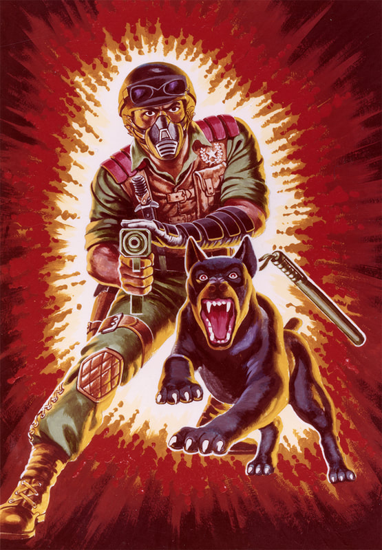
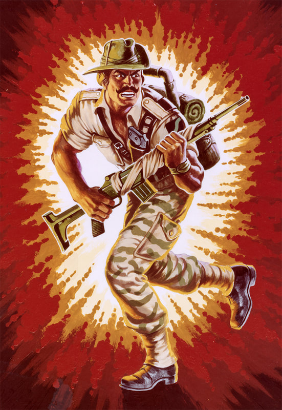
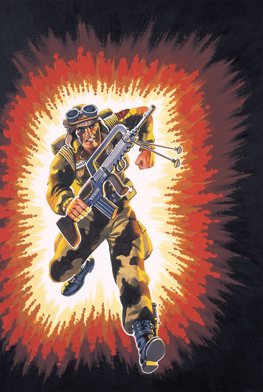
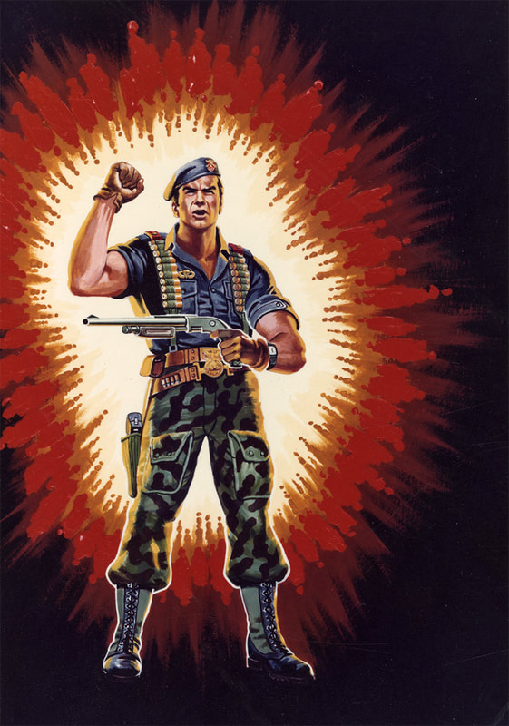
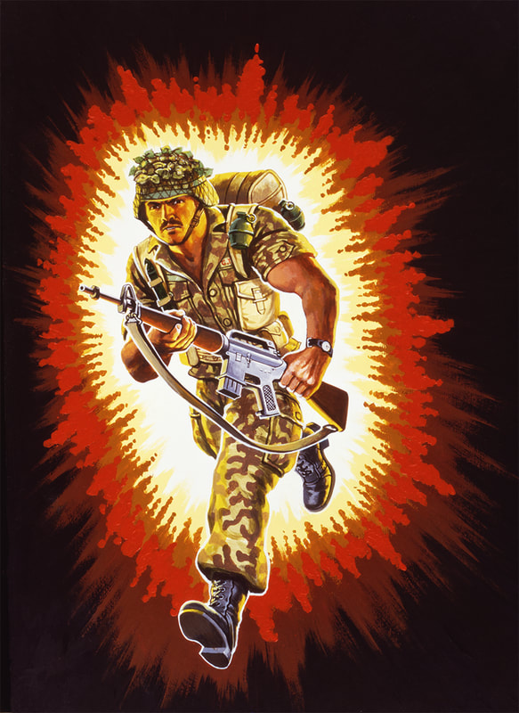
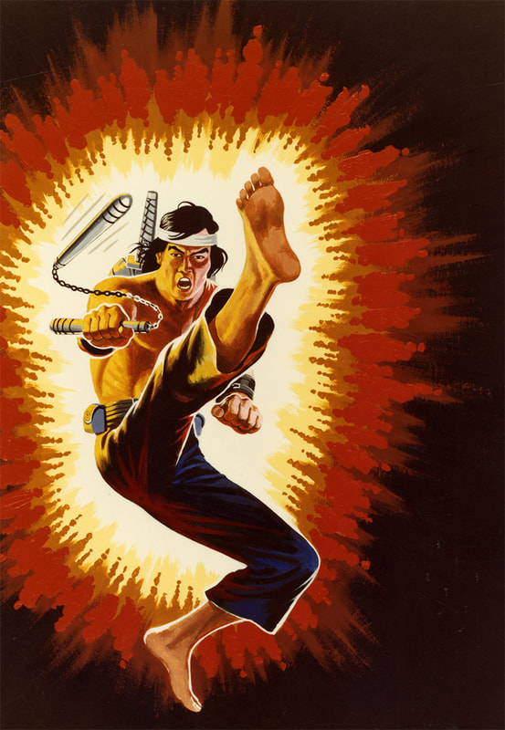
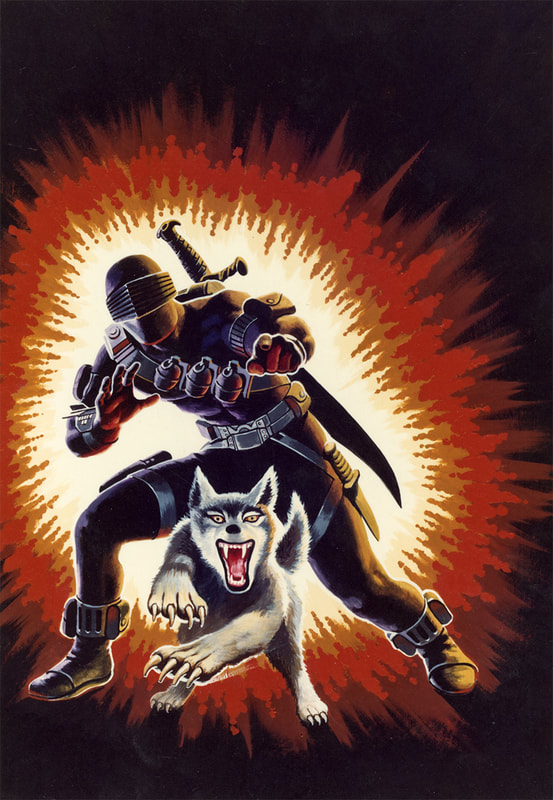
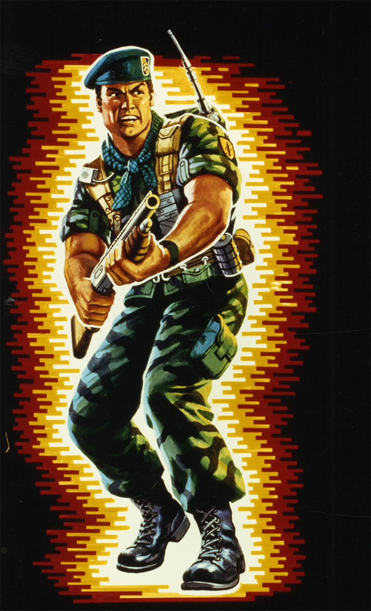
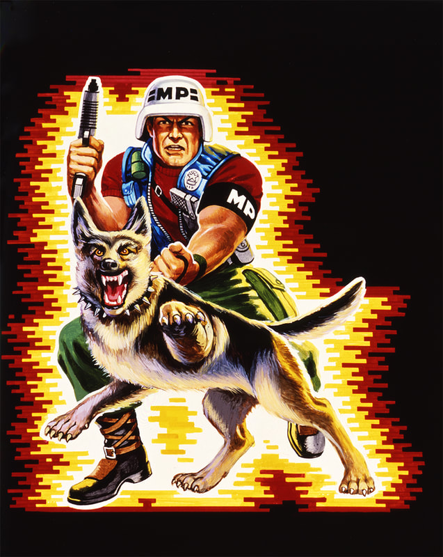
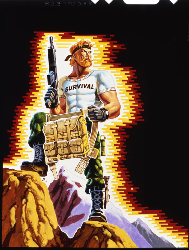
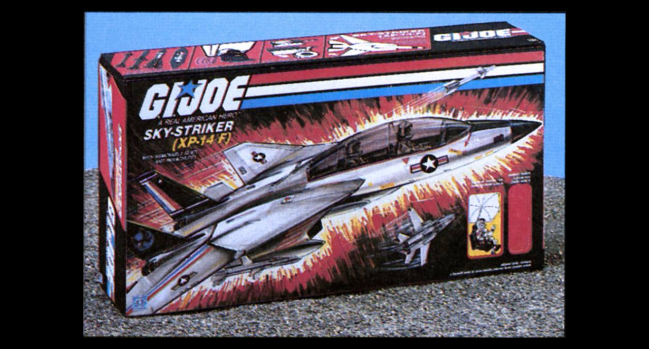
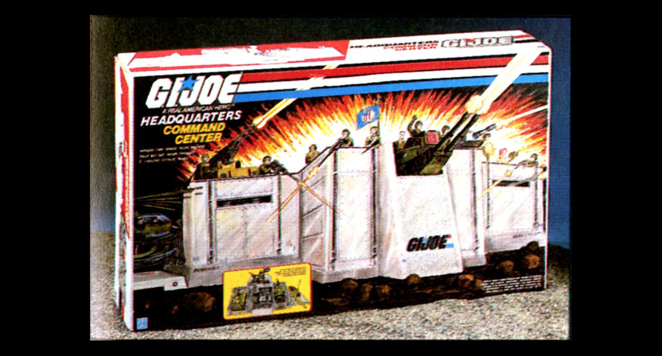
They needed color to entice consumers to the shelf. They needed something eye catching. It needed to be hand drawn and customizable. It needed to match whatever their needs were for each product. They needed an EXPLOSION! It would represent a real explosion, but it would be simplified, illustrative. They wouldn't show realistic details like shrapnel or flying objects. The product would be integrated into the explosion. Figures and vehicles would not be cut out and placed on these explosions; the explosions would envelope and light them instead. The colors of the explosion would give the artist artistic license to add more color to the products than would otherwise be justifiable. For example: see how Recondo's face (right) shows yellow reflection on the left side, and white on the right side? The colors of the explosion create this lighting effect, which allows the product to use a much richer color palette. So, from top to bottom, they created shelf impact with a bold, unencumbered logo popping off of a black background. This black background was entirely unique, as no other boys toy came close at the time. The stripes are patriotic and also a conscious branding tool that was customizable (they could extend infinitely on vehicles and playsets) and be broken (intersected / overlapped) by the artwork. Finally, 50% of the package (on the figure cards) was customizable. Behind the placement of each figure would feature its own unique background color that maximized the contrast of the figure from the card, helping make that pop just like the logo. |
Managing the art of A Real American Hero
So now that the logo and explosion background were set, they needed the perfect illustrator. By 1981, Don Stivers had migrated from illustration to fine art western paintings. So, Ed Morrill went back to Mendola Artists Representatives seeking a dependable, fast painter who could work weekends. Ed recalled his first impression when meeting Hector Garrido was that he was "a very shy, sweet, very gentle man."
Morrill had a huge role in the creation of packaging art. He would create loose sketches of the figures, vehicles and play sets for all the paintings that Hector Garrido would later base his painting. Ed Morrill paid particular interest to dynamic and unique poses and layouts across the line. Garrido would then create the final painted art with his preferred medium: gouache. Gouache paint consists of pigment, water, and a binding agent. It is mixed with water to achieve the desired working properties and to control the opacity when dry. Many manufacturers of watercolor paints also produce gouache, and the two can be used simultaneously. Like watercolor, gouache dries to a matte finish. Unlike watercolor, Gouache is normally used in an opaque painting style, similar to acrylic or oil paint. Gouache was incredibly popular with commercial artists in the mid- to- late 20th century for its speed—the rapid evaporation of the water allows it to dry completely very quickly. Garrido’s mastery of this medium enabled him to complete a figure portrait every other day.
The collaborative process between CLS&M and Hasbro at that time was as follows:
I. Hasbro provided Ed Morrill with preproduction documents outlining upcoming products, usually a handful of products at a time
II. Ed Morrill would sketch the entire lineup in black in white and present photostat copies of these layouts to Hasbro. These photostats were sent overnight by FedEx (this was before the rise of the fax machine). There was no opportunity for color copies at that time. Ed recalled "I dragged my feet on getting a fax machine, because I knew my life would be over. We’d never have the “out the door by 9pm” excuse to move onto the next task."
III. These sketches were reviewed and marked up by Hasbro and returned to Ed Morrill with suggested revisions.
IV. Ed Morrill would revise the sketches and then send them off to Hector Garrido for illustration
V. Hector Garrido would paint from his Connecticut studio, then overnight them back to Ed Morrill at CLS&M
VI. Ed Morrill would review and either forward to Hasbro or deliver and present personally.
The turnaround times for G.I.Joe: A Real American Hero artwork were lightning fast. Ed Morrill would send sketches for 3-5 products and any available reference materials that he'd received from Hasbro to Hector and Hector would send the finished paintings back in about a week. Ed recalled that Hector Garrido was a busy guy. He was in high demand, working on book covers and magazine illustrations in addition to his G.I.Joe work. According to Ed, if Hector knew G.I.Joe work was coming, and Ed was able to book him, he could knock 3-5 package paintings out in 7-10 days.
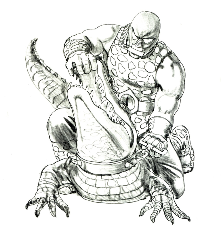
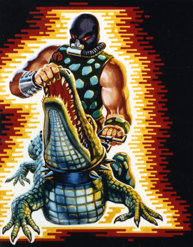
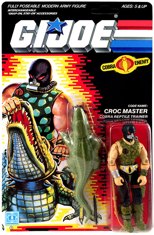
Most collectors are unaware of Ed Morrill's involvement in sketching the layouts for Hector Garrido in the 1980s and Don Stivers in the 1970s. When asked what his approach consisted of, Ed recalled "Every figure should have energy and excitement. The figure should be caught in the moment of something happening. Tension is key. The package art should never simply be a rendering of a posed figure." Below is an example of a sketch for Croc Master and Hector Garrido’s final packaging art for the figure. While we don’t have any sketches that Ed drew personally (because most were delivered directly to Garrido and lost to time) we do have the Croc Master sketch below which came from Ed’s collection of paperwork. Roll over the images below for more information, or click to view the image at full screen.
Ed recounted the process of creating memorable package art for each figure and vehicle: "Hasbro would provide us with as much product information as was available at the time. I would review the whole line of characters, or as many as were available in the heat of the development battle, and l would identify what made each one unique. What was the personality, the weapons, the back packs, etc.? What would be the best pose that would show it all off, while differentiating each figure from all the others in the line? For the vehicles, what was the best angle to view the oncoming jeep to show its special details yes, but also to look at it in a way to give it a sense of motion and impact. Often a “worm’s eye view” worked well with forced perspective to make you feel part of the action. We exaggerated and took artistic license because the actual products were always shown behind the blister pack or in detailed photography on the back panels."
Ed recalled Hector Garrido turning these sketches into unforgettable illustrations: "Hector would then work his magic and breathe real life into his art. His characters were real, with facial expressions that were intriguing and commanded your attention. You did not visualize the figure as it was in molded plastic with only a bit of detail, but as the real-life character that Hector created. They jumped off the package, propelled by the explosion, and into the imagination of countless kids of the day and for many to this very day as well!"
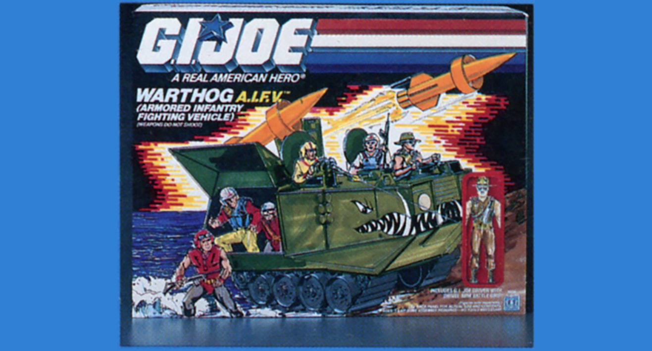
Below are some samples of the 1980s artwork Ed Morrill and Hector Garrido created for the G.I.Joe: A Real American Hero. Roll over the images below for more information, or click to view them full screen.
|
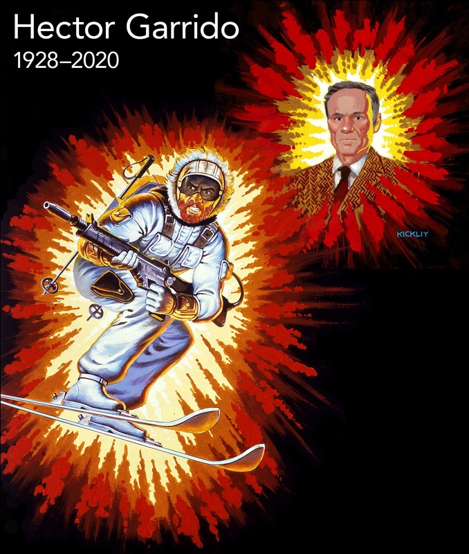
Hector Garrido and Ed Morrill worked together for eight years before Coleman, LiPuma, Segal & Morrill decided to part ways with Hasbro in 1989 (more on that to come). When Hector passed on April 19, 2020, his friend and art rep reached out to 3DJoes for our help in breaking the news to the community. We reached out to Ed Morrill for help in crafting this announcement. We re-present Ed's words here:
"I join the legions of G.I.JOE fans in mourning the passing of Hector Garrido. It was my great pleasure and good fortune to have had the opportunity to collaborate with him in the creation of so many exciting illustrations for A REAL AMERICAN HERO. Hector was obviously incredibly talented, but he was also a true professional. Through all the years of working together I do not recall a single time when he did not come through on time and on budget with great work. There was never a conflict with our artistic views and the need to accommodate the packaging requirements. Hector’s ability to work his magic and breathe life into these characters was remarkable. Every time the artwork arrived at my office door it was “camera ready”. He inspired the imagination of countless kids of the day and for many of us today as well. Here’s a salute to his talent and his memory!" Thank you to Kickliy for the wonderful Hector Garrido portrait. |
An explosive coincidence?
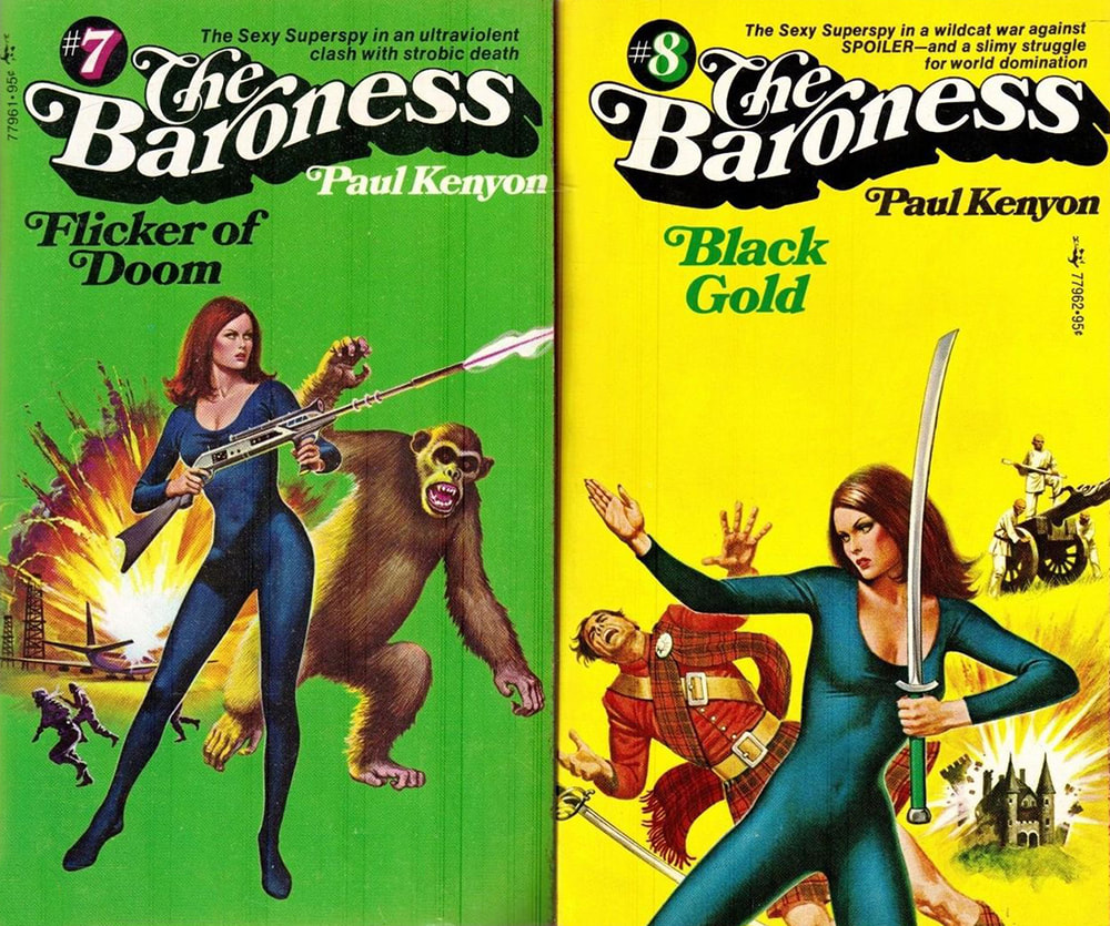
Just six years before being hired to illustrate A Real American Hero, Hector Garrido illustrated a series of paperbacks titled "The Baroness." Beyond the title character being a "sexy superspy" all clad in black, which is a big coincidence when we consider the leading Cobra female that would emerge in the 1982 G.I.Joe: A Real American Hero comic, you'll note several explosions on these book covers. Many of these explosions feature the same color palette as the explosions created for the A Real American Hero packaging. When asked if "The Baroness: Flicker of Doom" (below) could have inspired the A Real American Hero explosion, Ed Morrill replied “It's absolutely possible. But we wanted more of a graphic device, less of a realistic explosion.”
Why do G.I.Joe vehicles almost always move to the right?
Ed Morrill wanted kids to feel like they were part of the scene. He wanted the art to be immersive. The vehicles couldn't come straight at you because you needed to see more of them, so they settled on a 3/4 view. The standard practice at that time was that the art director would give the artist a photo of the product, but then the illustrators imagination was limited… the artist would not exaggerate. Ed provided schematics and a sketch instead. As a rule, the vehicles always moved left to right and that was important. This was so the cannons, missiles, laser blasts, etc. could intersect the speed lines of the logo, not the logo text.
See back panel for actual size
Federal regulators actively protect consumers from false advertising and misrepresentation of consumer products. So what enabled Hasbro to use such fantastical art to sell their toys?
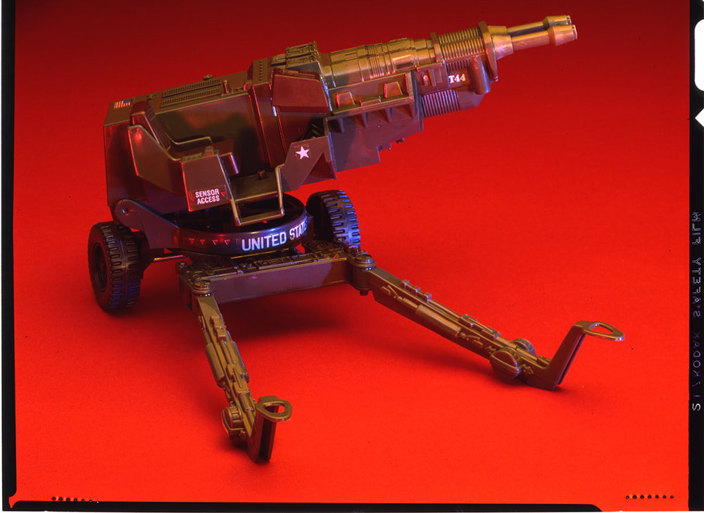
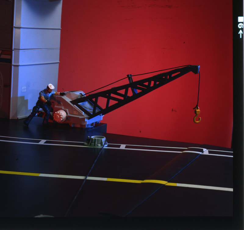
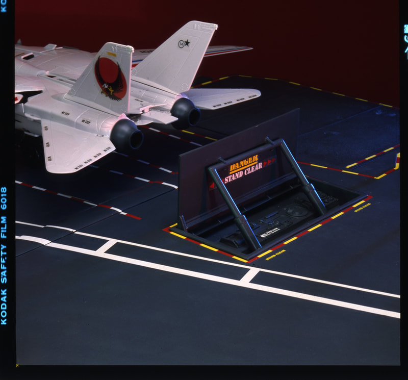
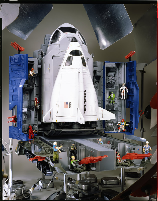
Hasbro was able to take artistic license with the package art because consumers could always see the actual product they were buying. The figures and accessories were visible through their clear bubbles, while the vehicles and playsets were shown in product photography on the back of each package. They also showed product photos in the cross-sell catalogs that were inserted with every vehicle and playset. Ed Morrill was responsible for creating this photography. Ed was always on set. If it were G.I.Joe or Weebles or whatever, Ed was there. He was a self-described control freak. That’s where the nights and weekends came in.
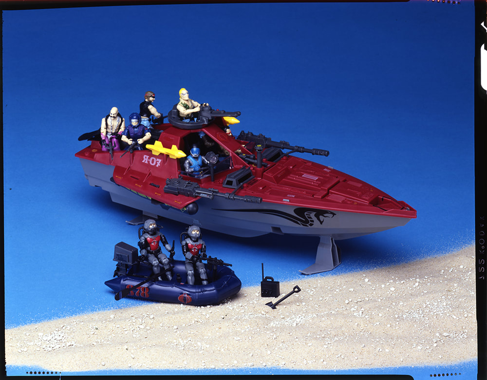
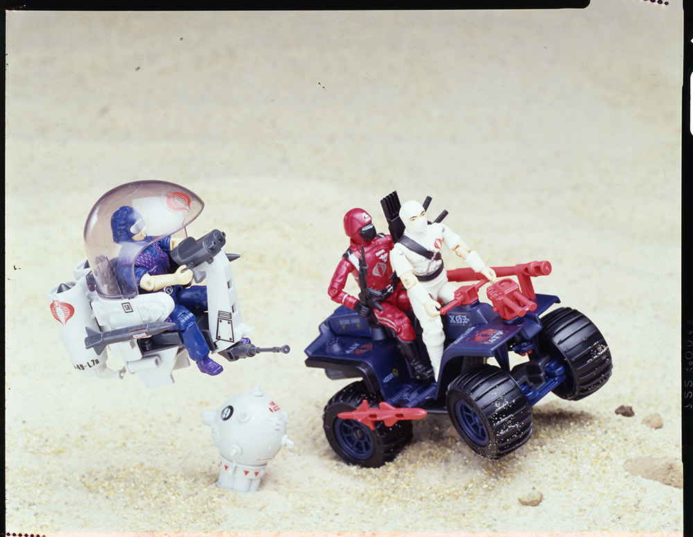
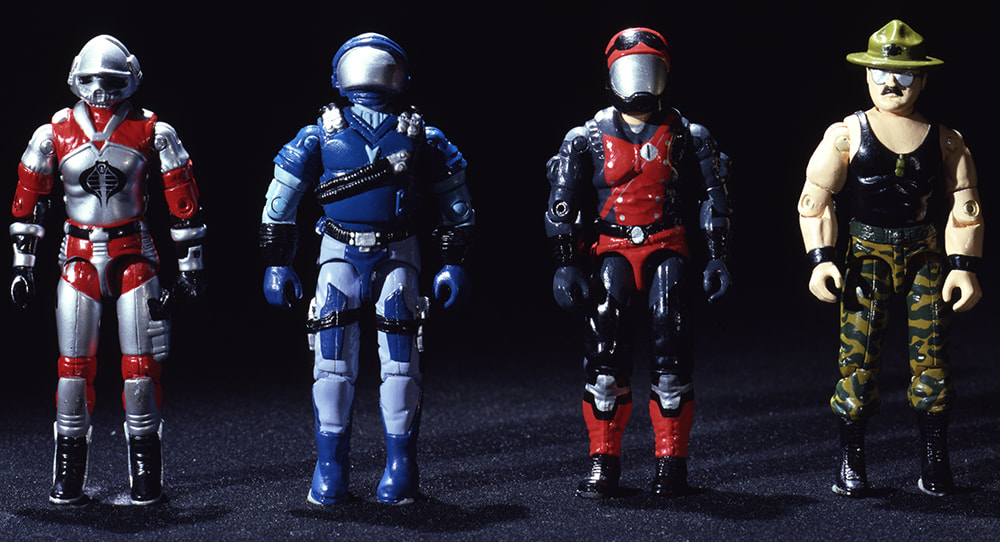
The intention for these photos was to show consumers what they were actually buying, and to give Hasbro license to take liberties with perspective and foreshortening within the art on the front. It is worth noting that many of these product photos feature prototypes, since product packaging was created in parallel to the manufactured toys. Roll over the images below for more information or click to view the images at full screen.
Revising the art of G.I.Joe
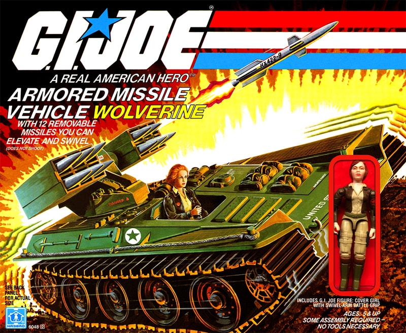
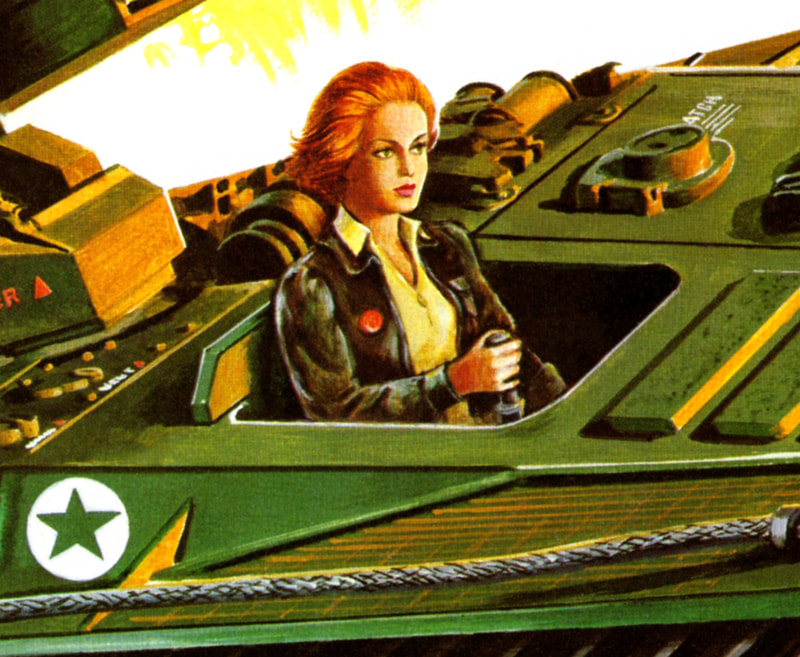
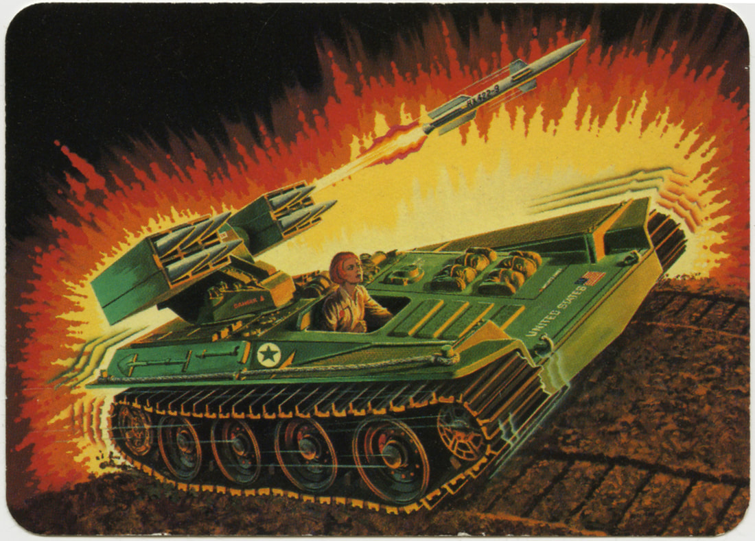
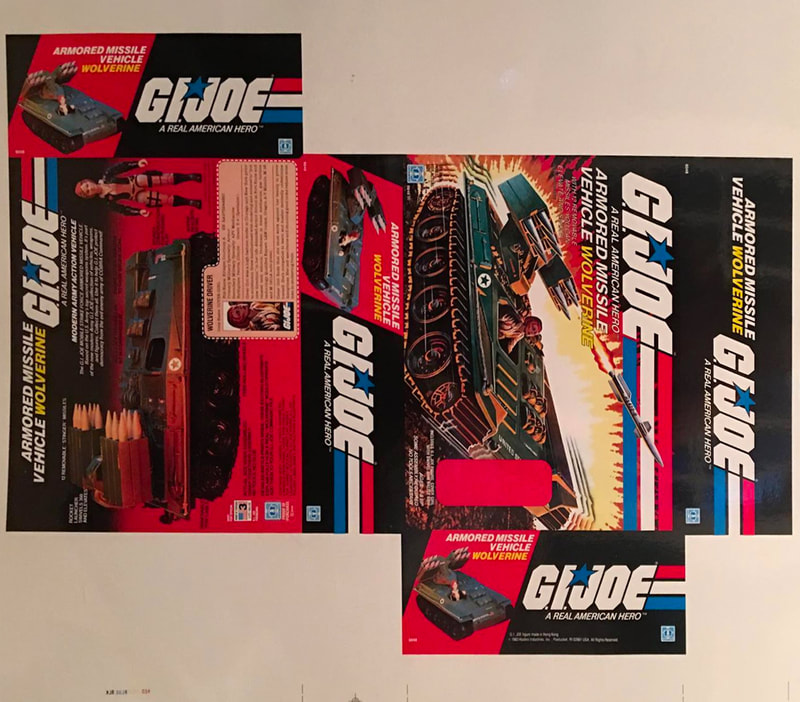
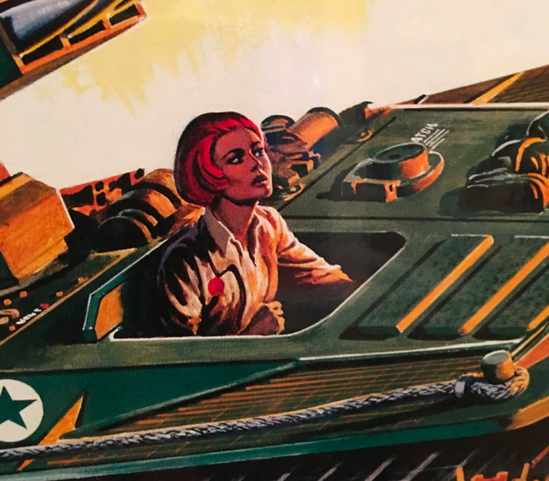
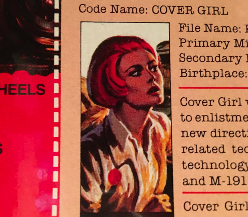
There are many instances of published G.I.Joe art variations. One example is the 1983 Wolverine box art. Most collectors know the retail box art, featuring an upright Cover Girl with windswept hair. Some eagle-eyed collectors spotted a much different Cover Girl portrait on the 1986 Milton Bradley Wolverine trading card. Here she is leaning forward and has a look of intensity that was lost on the published box art. Preproduction collector John Wakefield was able to share a printer's proof from 1982 that confirms what was previously an unsubstantiated theory: the more dramatic portrait printed by Milton Bradley in 1986 was the original package art! Roll over the images below for more information or click to view the image at full screen.
We believe these revisions were completed in-house by Hasbro's art department. Ed Morrill added "I don’t remember ever having a single piece of finished art kicked back for revisions. There wouldn’t have been time."
When shown these Cover Girl variations, Ed responded that "If the product changed there could’ve been a revision, and that would’ve been done in-house." He added in regard to the Cover Girl revision "I don’t believe that is Hector’s work. The previous art had drama, she’s got concerns, someone is trying to blow her away. The [revised] art looks like she’s on her way shopping. She’s just not involved. It screws up the whole package. She’s still being a high fashion model driving this 40-ton vehicle. There is no relaxing in that situation."
Hearing Ed's passion for this artwork 40 years later was just astounding. You can tell how much it meant to him and how much thought and effort went into making each piece of art compelling.
Ed added regarding revisions that "at some point in time they were clearly sending things to Hector that I wasn’t informed of. Hasbro was circumventing our design firm and going straight to the artist. I understand that: it was less expensive and potentially more efficient. He wasn’t my illustrator; he was their illustrator, and I was hiring him. They never promised our company that they would send us everything. The handshake agreement was that we would not work for other toy companies."
The joy and anguish of Toy Fair
One of CLS&M's primary responsibilities was creating mockups for Toy Fair. Toy Fair was the most important week of the year for toy makers. Here they would show off upcoming products and take orders from all of the major toy buyers. Toys lines and the companies that made them lived and died by how well they were received at Toy Fair. No pressure, right?
“Hasbro was selling pipe dreams. They were selling items that in some cases would never even make it to market.” What Hasbro gave CLS&M as reference material varied by how far along they were in the production process. Polaroid’s were a way of life. Hasbro mostly provided those for reference.
“Hasbro wanted complete, all sides packaging" for Toy Fair. “Everything was done by hand. There was no digital anything at that point.” CLS&M would create C-prints (chromogenic prints) and then transfer type to create mockups for Toy Fair. All logos were cut out by hand. The rest of the copy was press type on gelatin / wax paper and was transferred onto the c-print by rubbing. Ed recalled that "if you screwed up the positioning, it was really hard to be fixed." Again: No pressure, right?
"it required a great amount of organizational skills and use of resources. In those early years all the client input, all the directions, all the materials came by face-to-face meetings at Hasbro in Rhode Island, by overnight messenger, by mail, by telephone. Given the pressure on the folks at Hasbro to come up with all the rough sketches, early prototypes, package sizes, AND COPY! in the first place, it is hard to believe we always made it happen."
Ed recalled with excitement: “It was chaos. Guys working night and day building stuff. You couldn’t help but think: this is going to be a disaster. It was exciting. To this day if I look at that old Toy Fair building, I get floods of memories.”
When it was showtime, Hasbro's internal marketing team presented these products to the public. Ed's team was on standby, ready to address any last-minute needs.
Toy Fair marker comps
In the packaging world, a comprehensive layout, usually shortened to comp, serves as a draft of the final layout. In addition to the more refined Toy Fair packages, CLS&M and/or Hasbro's internal art department also had to create marker comps that would be photographed and included in the Toy Fair ordering catalogs. These ordering catalogs had to go to press before Toy Fair, so timelines were even tighter. The loose marker comps were always presented as smaller images in these publications, in an effort to not draw too much attention to the unfinished look of the artwork. Below are some examples of marker comps presented in Toy Fair catalogs. Roll over the images below for more information or click to view the image at full screen.
Evolving the G.I.Joe: A Real American Hero brand for 1986
A lot was happening by 1986. Hasbro was firing on all cylinders. The G.I.Joe: A Real American Hero launch in 1982 was a runaway success, and that enabled Hasbro to license Takara's Diaclone and Micro Change toy lines to rebrand them for Western markets. Hasbro's Transformers brand launched in 1984 and again Hasbro was met with unparalleled sales. Ed Morrill and CLS&M were once again responsible for the branding and package design for the Transformers launch.
But sometimes, success brings scrutiny. More and more folks at Hasbro wanted to leave their fingerprints on these successful brands. They began calling for a more contemporary, technology-focused, high-tech look for G.I.Joe. By 1985, Ed Morrill's Hasbro clients were calling for a brand refresh.
But sometimes, success brings scrutiny. More and more folks at Hasbro wanted to leave their fingerprints on these successful brands. They began calling for a more contemporary, technology-focused, high-tech look for G.I.Joe. By 1985, Ed Morrill's Hasbro clients were calling for a brand refresh.
|
This would be an incremental brand refresh. It needed to capitalize on the wildly successful 1982 brand elements, but give the feeling of the next evolution of that brand. To that end, Hasbro decided to replace the 2D logo with the 3D logo. While Ed did not recall any other ideas that may have been presented, he said they surely had to do a design study, comparing the 1982 brand to competitors in that space. He added with a laugh that CLS&M "would’ve presented multiple options, or else how are you going to bill for it?"
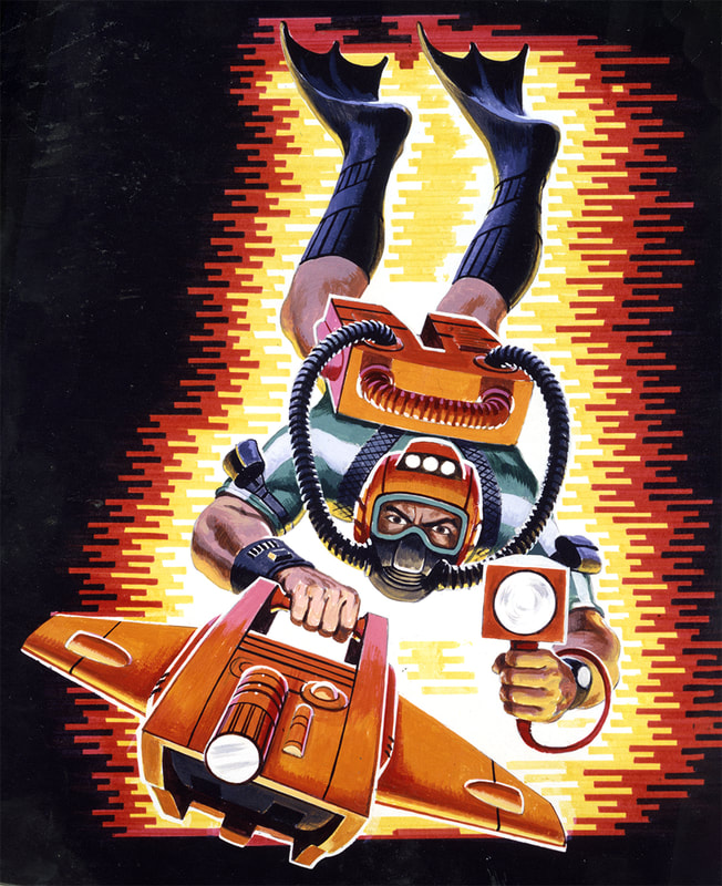
Hasbro ultimately decided to replace the explosive background with a digital looking linear burst. Ed recalled the design process that arrived at the new linear burst: "I went to my comp artists and we showed a range of options. We stayed with the color scheme. We didn’t want it to be engineered; we wanted it to be organic. It could be molded to fit the needs of the figure or bubble. It was a flexible device and still served to light the figure." This was still before the advent of desktop publishing, which would upend the industry in a few short years. The horizontal lines were created by hand with markers. The goal was to create each line with one stroke. Overlapping strokes of the same color would create more color variation and that was not the clean look they were going for. They'd start with yellow, let that dry, then go back in with the red on top. It was a painstaking and laborious process that was lamented by both Ed Morrill and Doug Hart. By 1985 Hasbro began using internal artists to supplement Ed Morrill and Hector Garrido's work. Ed recounted that he did not "recall a single year of producing art for 20 figures." He added that Hasbro "could have been supplementing CLS&M's work with internal resources as soon as 1985 due to timeline constrictions and budget considerations." When we reviewed the mid-80s artwork with Ed Morrill, several pieces were identified as unlikely to be Morrill and Garrido's work, to include: 1983 and 1985 Cobra S.N.A.K.E., 1985 Sears exclusive Cobra C.A.T. and S.M.S., and 1986 Sears exclusive Dreadnok Air and Ground Assault. By 1987 Hasbro's art department had begun making design decisions that Ed Morrill disagreed with. Some examples came up while reviewing the 1987 Battle Force 2000 card backs. The BF2K logo was pushing the figures head's down. This logo was putting pressure on the illustrations – eating into their real estate. To make things worse, they'd changed the linear burst to blue and purple lines, and as a result there was no explanation for the yellow/orange light source seen on the figures. Those colors came from the explosion in the past! Where were they coming from now? |
As I discussed these packages with Mr. Morrill, I couldn't help but marvel at the thought process that went into each packaging decision and the passionate response all these years later when that logic was subverted.
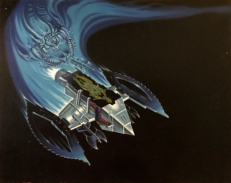
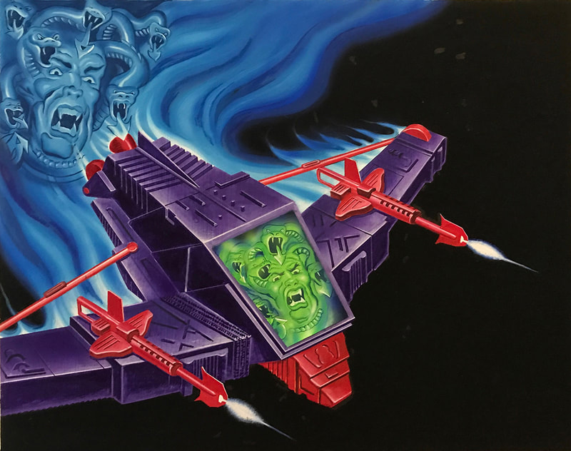
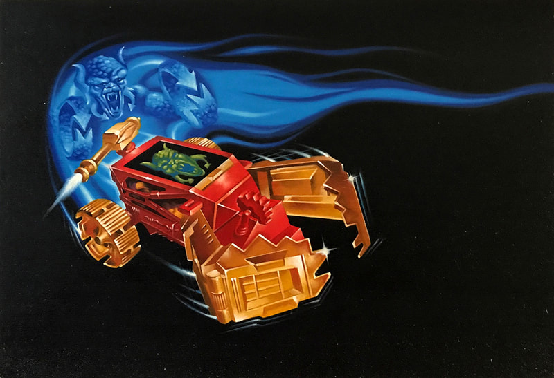
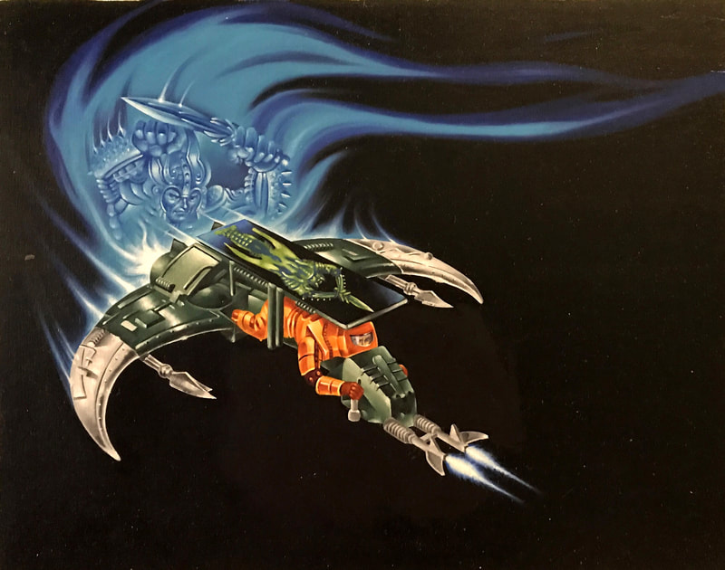
Managing the art of Visionaries
In 1986, AGE (Abrams Gentile Entertainment, Inc.) brought a concept to Hasbro that made holograms affordable. AGE's Chris Gentile had developed a patented holodisc hologram (you can learn more about Gentile here and here). Hasbro licensed the IP and further refined it with AGE and Griffin Bacal to become Visionaries: Knights of the Magical Light. Ed Morrill and CLS&M were once again responsible for branding and package design.
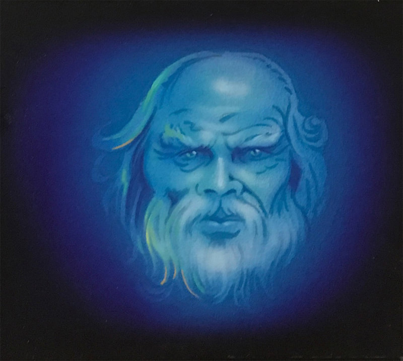
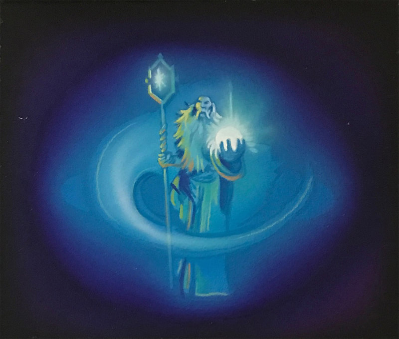
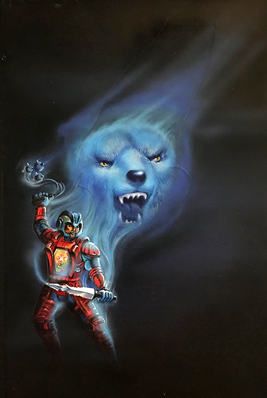
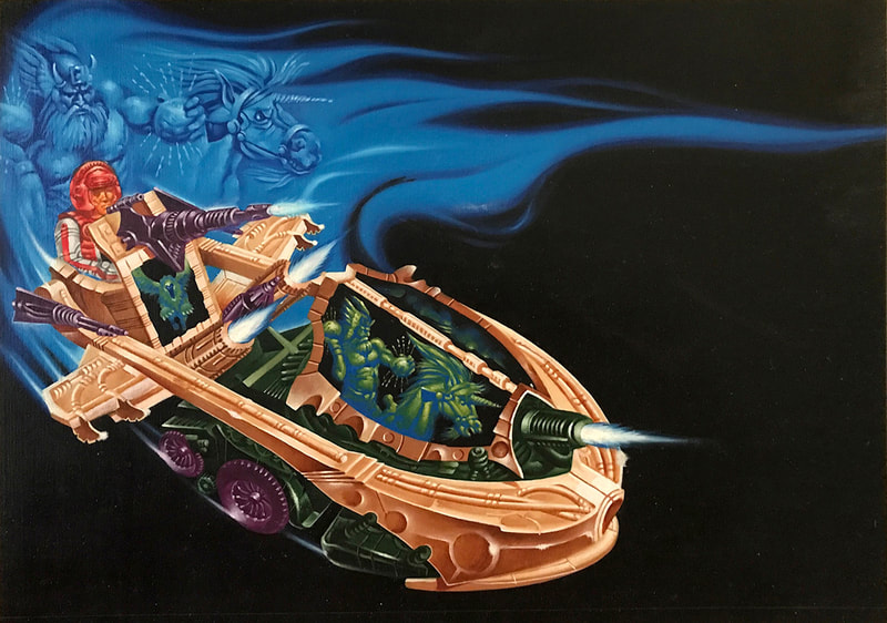
Below are a selection of unadorned Visionaries paintings created by CLS&M on behalf of Hasbro. Most are unused paintings from the canceled second series. Roll over the images below for more information or click to view the image at full screen.
Below are a selection of unadorned Visionaries paintings created by CLS&M on behalf of Hasbro. Most are unused paintings from the canceled second series. Roll over the images below for more information or click to view the image at full screen.
1989: The end of an era
Ed Morrill and Hector Garrido worked on G.I.Joe together until 1989, when Coleman, LiPuma, Segal & Morrill decided to part ways with Hasbro. That decision was years in the making. Ed was moving into new business and client management roles, and Hasbro’s needs demanded more time than was available. Hasbro was growing, and their art department was evolving. They were becoming more skilled. There were people in Hasbro's art department that were looking to be next in line to take over for Matt Lizak and were selling themselves as being more than capable of taking over for CLS&M (Ed Morrill's company).
For 20 years Werbin and Morrill Inc. and CLS&M had operated on a handshake agreement: they would not work for any other toy companies, and Hasbro would maintain a steady stream of work for them. Ed added "My guardian angel was Stephen [Hassenfeld] there in the background. He recognized our contributions and appreciated us making the commitment to Hasbro. Things generally flowed pretty smoothly on the creative end as a result of the reliability, relationships and trust." Stephen Hassenfeld was Chairman and Chief Executive Officer of Hasbro from 1980 until 1989.
He recalled one day when he visited Pawtucket for a presentation: "Marketing and design were in the room. Some knew me, some didn’t. I'd always have to win over new people in each presentation. Afterwards we went to the cafeteria. It was a big open room, and everyone was in there. I was at table in the corner with 3-5 guys, when Stephen came in from the far end and yelled, “Hi, Ed” and came across the room and gave me a back rub. It was something. People at the table, their mouths fell flat open. You can’t buy that kind of promotion." When Stephen Hassenfeld passed on June 25, 1989, Ed Morrill lost a powerful and trusted ally.
Soon pricing became an issue. Hasbro started to apply pricing pressure, such as overtime pay was no longer allowed, despite CLS&M staff working weekends to meet tight deadlines. While CLS&M was paying their freelancers double time, Hasbro no longer wanted to pay overtime. In Ed's words, "The account people were giving away the farm."
These pressures eventually resulted in the conclusion of the 20-year working relationship between Hasbro and Ed Morrill.
Hector Garrido was under no exclusive contractual obligation to CLS&M, and he continued working with Hasbro in a freelance capacity through the end of the A Real American Hero line in 1994.
Coleman, LiPuma, Segal & Morrill continued to find great success in the consumer packaged goods space, creating innovative designs for Gillette, 3m, Castrol, Nestlé, and more. The firm was the earliest and arguably the most successful pioneer of desktop publishing in the early 1990s, using the Lightspeed, the Macintosh Quadra and the earliest versions of Adobe Illustrator and Photoshop, which were introduced in the late 1980s. CLS&M's success caught the eye of Interpublic Group, a global provider of marketing solutions based in New York City. Interpublic, or IPG, wanted to buy CLS&M. Owen Coleman wanted in. Ed Morrill did not. Rather than torpedo the deal, Ed Morrill sold shares around 1994. He stayed on for another two years as Managing Director at the request of clients.
After retiring from the field of package design, brand identity and corporate identity, Ed Morrill formed Morrill Support in 1996 with his wife Joyce. Morrill Support reflects their combined and individual work in the areas of digital imaging, fine art photography, fine art printing, retouching, graphic design, writing and editing, and bookmaking. Here Ed focuses on creative image making, where he strives to create visual compositions that are fresh, unexpected and intimately his own. Visit Morrillsupport.com for visuals.
Ed Morrill visits 3DJoes HQ!
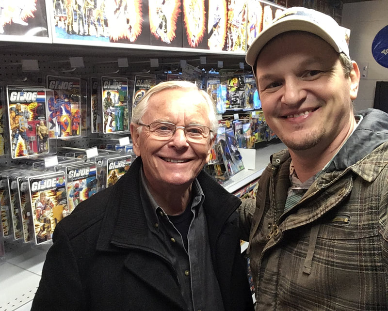
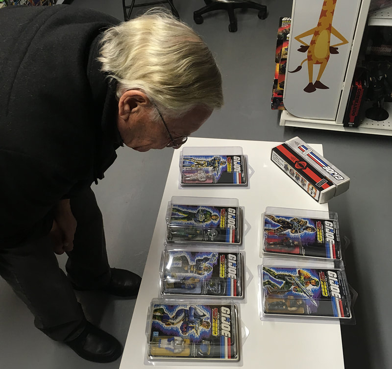
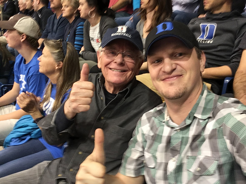
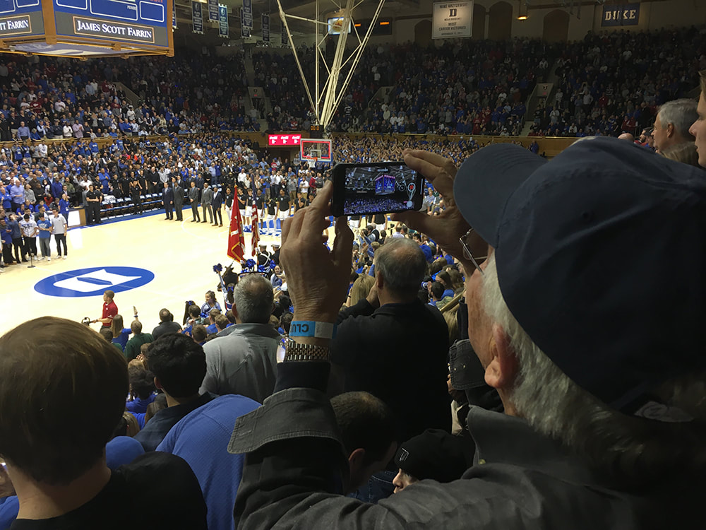
Back in November 2018 Ed Morrill made the trip from Queens, NY to Raleigh, NC to visit 3DJoes HQ! While here we reviewed many A Real American Hero packages and discussed his recollections of working on them. We worked to nail down proper credits for each package and to gain clarity on which packages were produced by Morrill and Garrido, and which were not. When the work was done, we headed to Durham, NC to treat this lifelong Duke Men's Basketball fan to his first game at the unforgettable Cameron Indoor Stadium. We were in luck, as Zion Williamson (the 2018-2019 Consensus National Player of the Year) was there to lead the Blue Devils as they routed Indiana 90-69. Honestly, these memories are so much bigger than the toys. I'll be forever grateful to have had these opportunities to meet my heroes and document their work.
Want more of the Ed Morrill story?
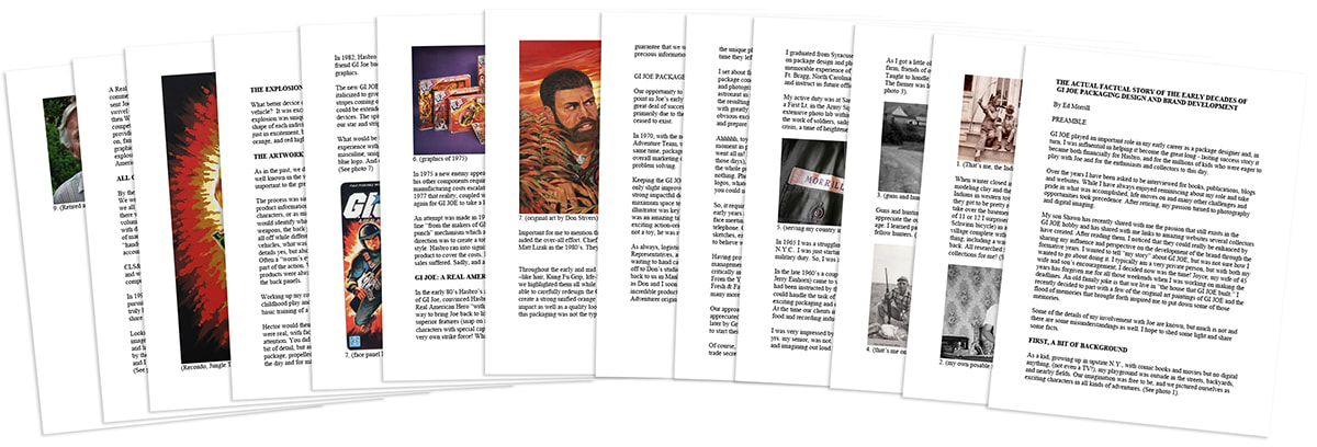
Shortly after meeting Ed Morrill and striking up a friendship, Ed sent me “Download Ed Morrill's Actual Factual Story of the Early Decades of G.I.Joe Packaging Design and Brand Development." This 13 page document details his upbringing and experiences in the Army that primed him for a successful career with G.I.Joe.
| Ed Morrill's Actual Factual Story of the Early Decades of GIJOE Packaging Design and Brand Development.pdf | |
| File Size: | 23862 kb |
| File Type: | |

